Unlocking the Art of Color Harmony: Vibrant Three-Color Combinations That Captivate
Color serves as a powerful, unspoken communicator in design, capable of elevating any environment from ordinary to extraordinary with the right blend.
Timeless Trios: Foundational Color Sets That Energize
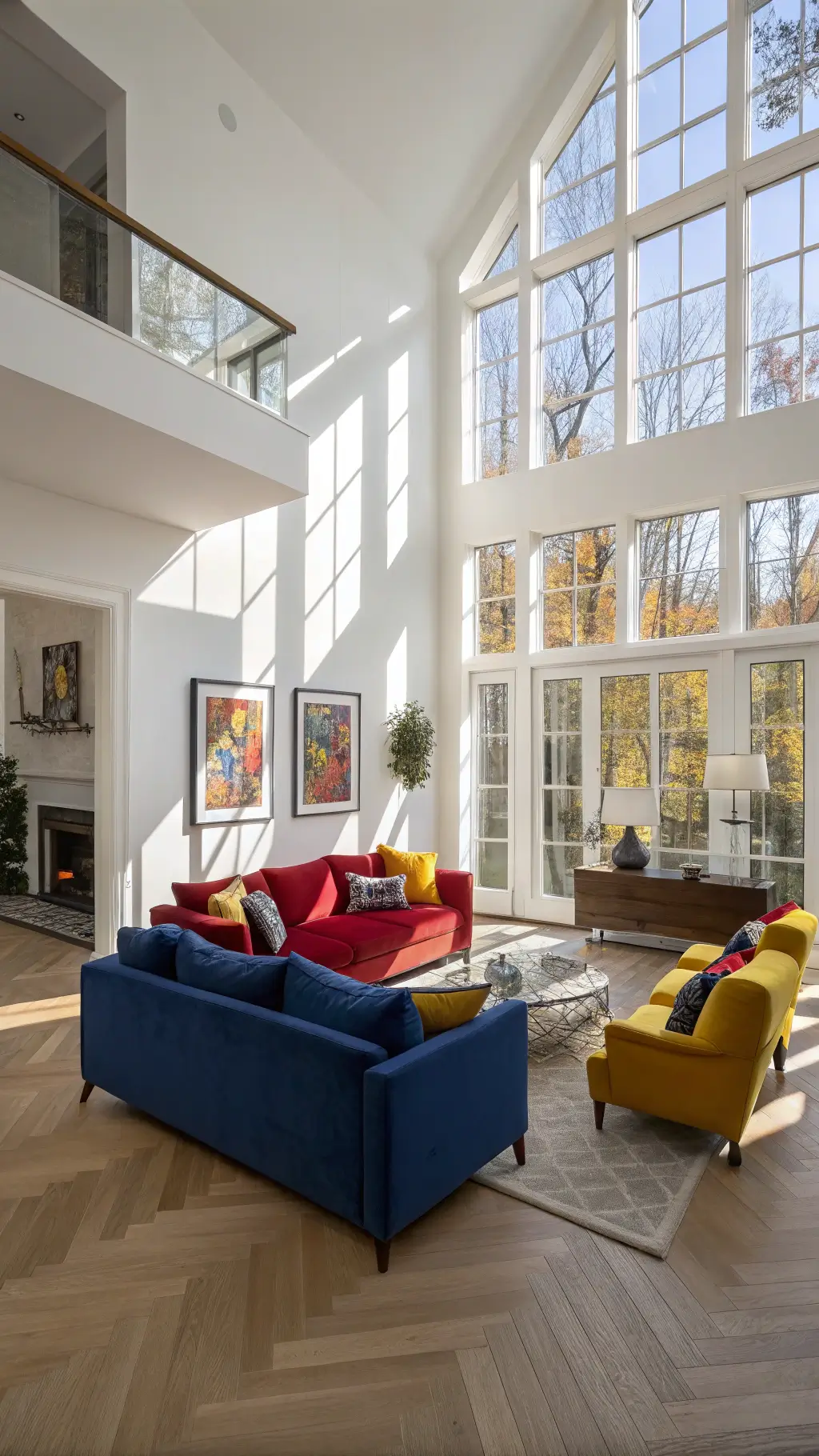
Primary Colors: Red, Yellow, and Blue
Far beyond early childhood art lessons, the primary colors form a dynamic and balanced palette that injects vitality into any setting:
- Enhances contemporary living spaces with boldness
- Essential for striking graphic and digital designs
- Delivers immediate visual excitement
- Embodies the core principles of color theory
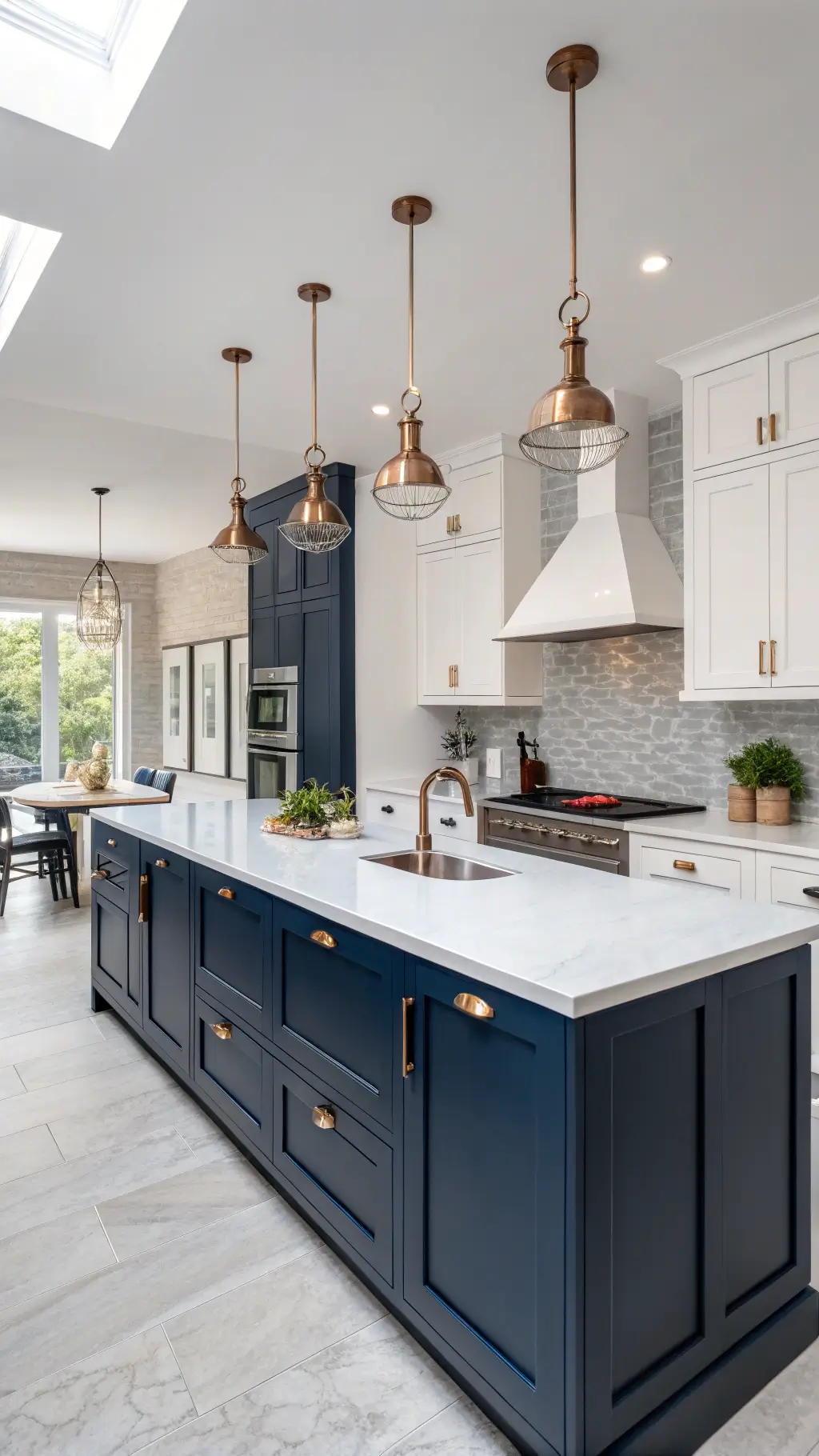
Modern Elegance: Bold and Unexpected Color Fusions
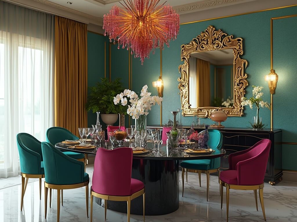
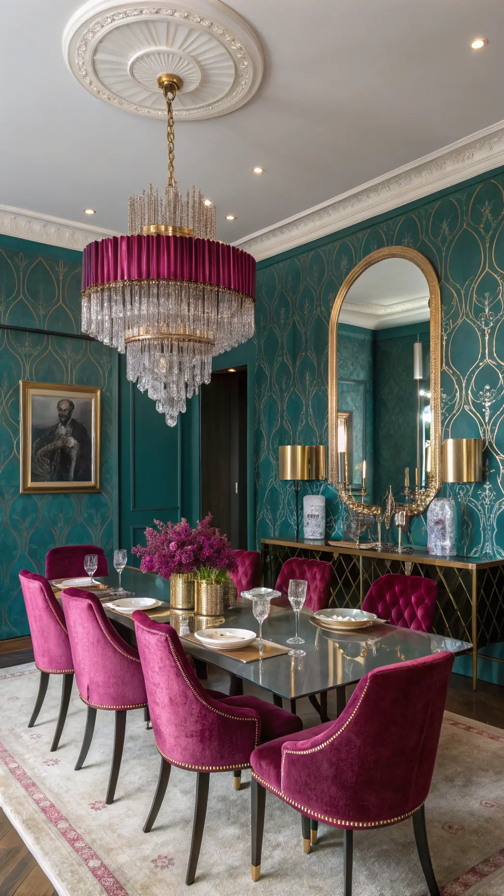
Teal, Magenta, and Gold: A Contemporary Luxe Blend
This sophisticated trio merges cool and warm hues to create a palette that feels both fresh and opulent:
- Seamlessly integrates contrasting tones
- Generates striking visual dynamics
- Perfect for chic, modern interiors
- Evokes a sense of luxury and innovation
Minimalist Sophistication: Subtle Yet Striking Color Choices
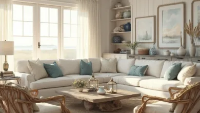
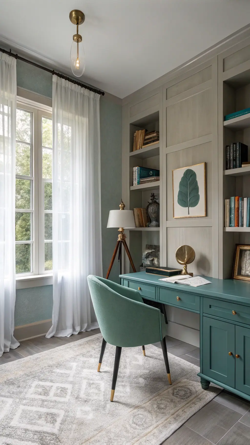
Graystone, Teal, and Emerald: A Calm, Refined Palette
Ideal for those who appreciate understated beauty, this combination offers:
- A fresh, contemporary vibe
- Perfect harmony for minimalist interiors
- A soothing, nature-inspired ambiance
- Elegance without overpowering the senses
Harnessing Color Theory: Techniques to Elevate Your Palette
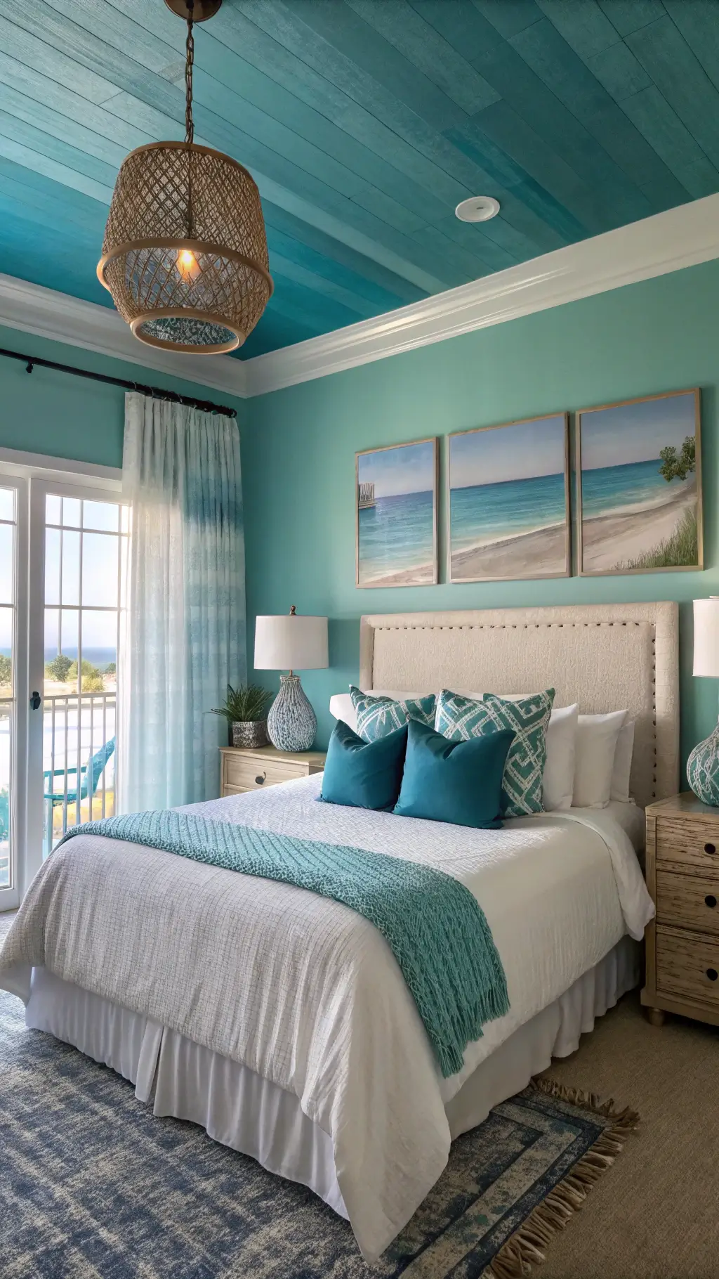
Analogous Color Schemes: Creating Seamless Flow
Using three neighboring hues on the color wheel fosters a harmonious and tranquil environment:
- Example: Blue, teal, and green
- Produces a cohesive and peaceful aesthetic
- Feels organic and well-integrated
- Minimizes visual strain and tension
Split Complementary Method: Balanced Contrast with Flair
This approach involves selecting a base color and pairing it with two colors adjacent to its direct complement, creating vibrant yet balanced contrasts:
- Start with a dominant hue
- Choose two colors flanking its complementary shade
- Example: Blue combined with yellow-orange and red-orange
- Delivers engaging visuals without overwhelming the eye
Expert Advice for Selecting the Perfect Colors
Utilizing Digital Resources for Flawless Palettes
Take advantage of modern tools to experiment with color combinations safely and precisely:
- Adobe Color Wheel
- Canva’s Color Palette Generator
- Enables risk-free exploration of hues
- Ensures accurate color matching for your projects
Essential Factors to Keep in Mind
- Assess the lighting conditions of your space
- Test paint or fabric samples in the actual environment
- Use swatches to preview colors before committing
- Observe how colors shift throughout the day
Choosing colors is both a science and an art form. Embrace your creativity, experiment with confidence, and design spaces that authentically express your unique style.