Transform Your Culinary Space: Stunning Chimney Kitchen Ideas to Inspire Your Next Design
The kitchen is often regarded as the soul of a home, transcending its role as merely a cooking area to become a vibrant hub where families and friends come together, forging lasting memories.
Effective interior design elevates this vital space, blending practicality with inspiration. A standout element in many kitchen designs is the chimney, which not only enhances functionality but also acts as a striking visual centerpiece.
Whether you prefer the cozy charm of rustic farmhouse styles or the clean lines of contemporary minimalism, chimney designs offer a wide spectrum of possibilities tailored to various tastes and lifestyles. This article delves into 20 innovative chimney kitchen concepts, each showcasing unique approaches to integrating this feature with style and creativity.
By focusing on material choices, color schemes, and spatial arrangements, these ideas invite you to imagine how a chimney can transform your kitchen into a personalized culinary sanctuary.
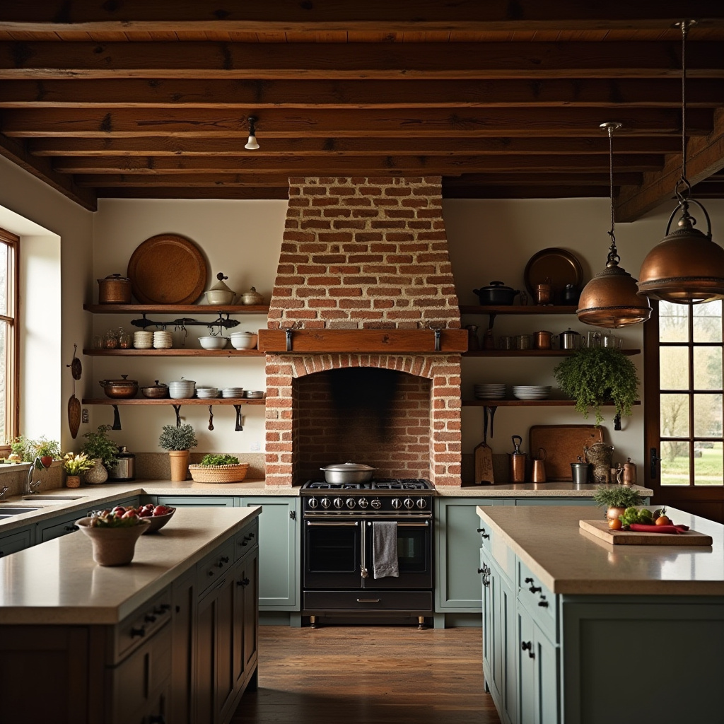
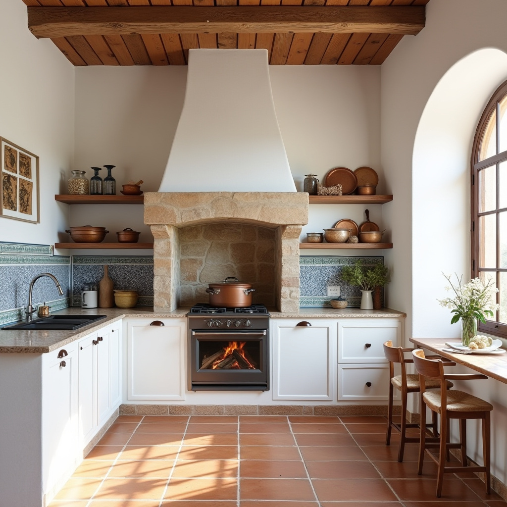
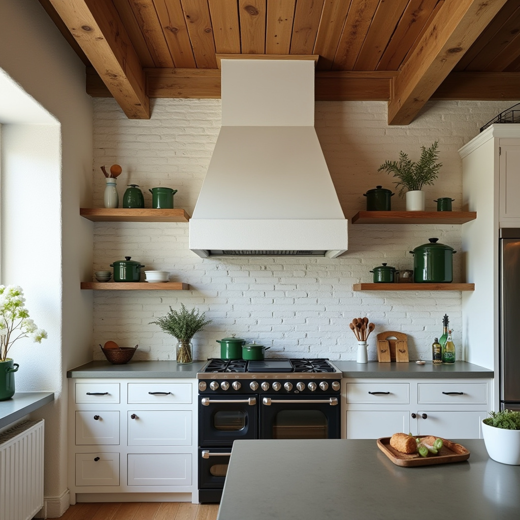
1. Cozy Farmhouse Kitchen Featuring Exposed Brick Chimney
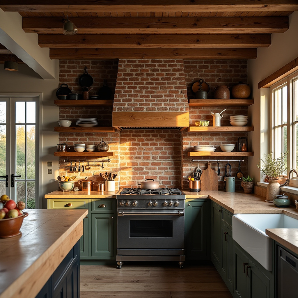
This farmhouse kitchen exudes warmth and nostalgia, anchored by an exposed brick chimney that commands attention. The reclaimed wood shelving, paired with vintage copper pots and cast iron pans, evokes a sense of heritage and comfort.
Durable natural stone countertops add both elegance and resilience, while the soft glow of natural light during sunset enhances the inviting atmosphere. Traditional architectural details like wooden beams and brickwork create a timeless setting perfect for intimate family meals.
- Incorporate reclaimed wood shelves for rustic charm and storage.
- Display vintage cookware to reinforce the farmhouse aesthetic.
- Opt for natural stone surfaces for durability and style.
- Maximize sunlight with expansive windows to brighten the space.
- Blend warm hues and textures to foster a cozy environment.
Expert Tip: To preserve the rustic vibe, select decor crafted from organic materials and earthy shades, steering clear of overly modern accents that might disrupt the harmony.
2. Sleek Minimalist Kitchen with Central Stone Chimney
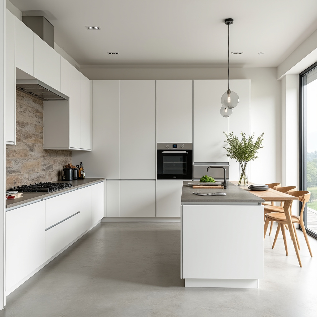
Embodying the essence of modern minimalism, this kitchen centers around a stone chimney that integrates flawlessly with pristine white cabinetry. Stainless steel appliances are built-in to maintain a streamlined appearance, while a floating wooden breakfast bar introduces warmth and intimacy.
Grey quartz countertops provide subtle contrast, adding depth without overwhelming the clean aesthetic. The interplay of materials ensures the space remains open, airy, and highly functional for daily use.
- Opt for integrated appliances to preserve a clutter-free environment.
- Install a floating breakfast bar to create a cozy dining nook.
- Use a monochrome palette for a refined, cohesive look.
- Incorporate textured surfaces like quartz for visual interest.
- Limit decorative elements to uphold minimalist principles.
Expert Tip: Enhance usability by incorporating concealed storage solutions that blend seamlessly with cabinetry, maintaining the kitchen’s sleek profile.
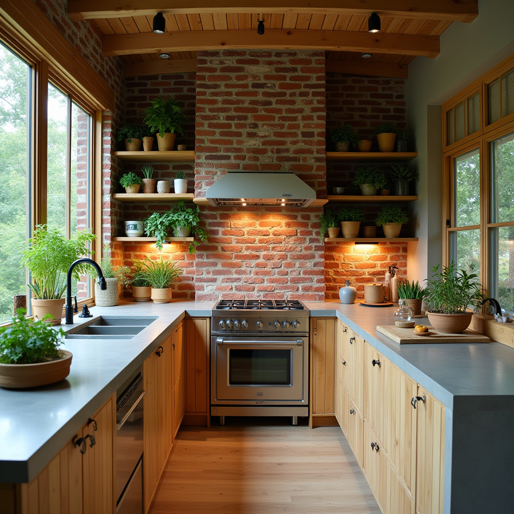
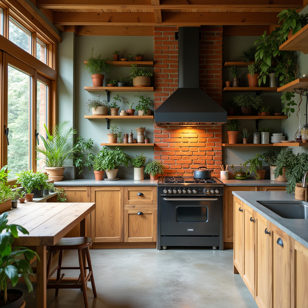
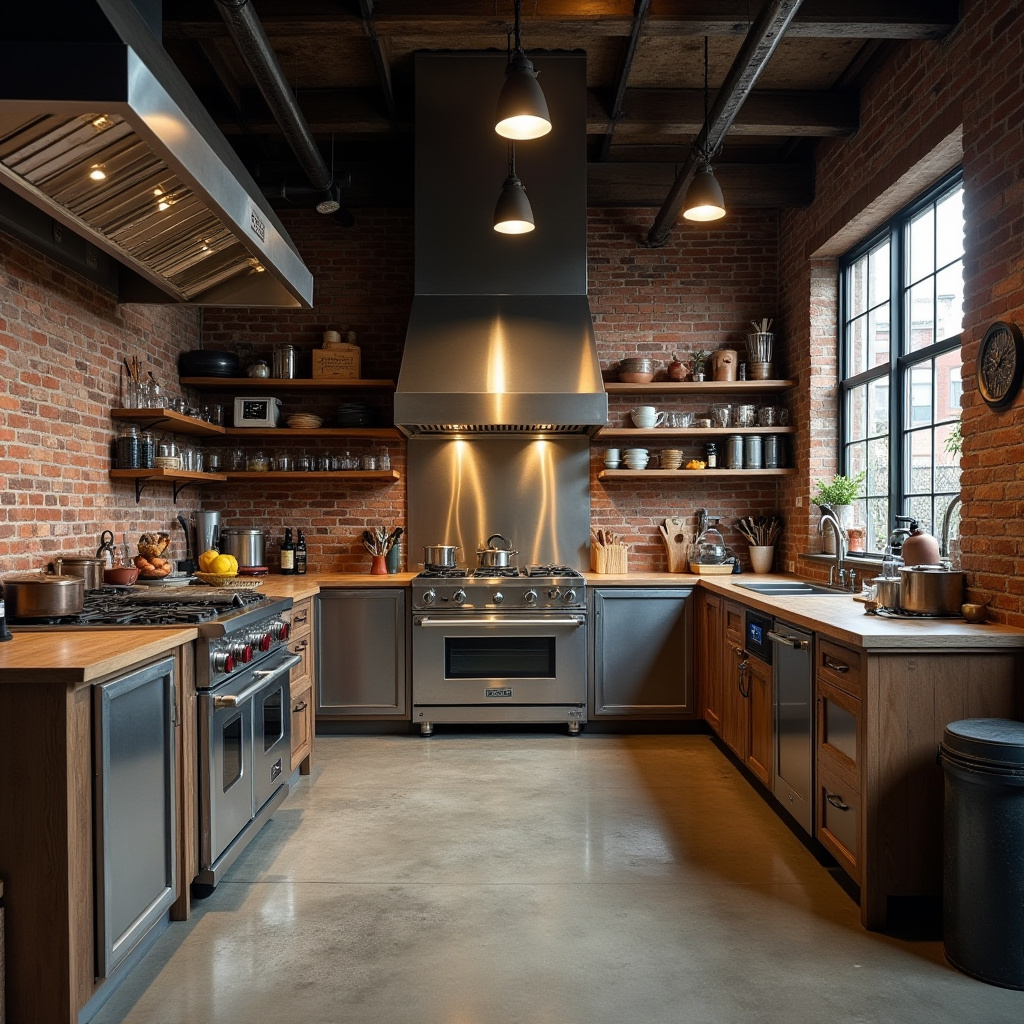
3. Urban Industrial Kitchen with Exposed Red Brick Chimney
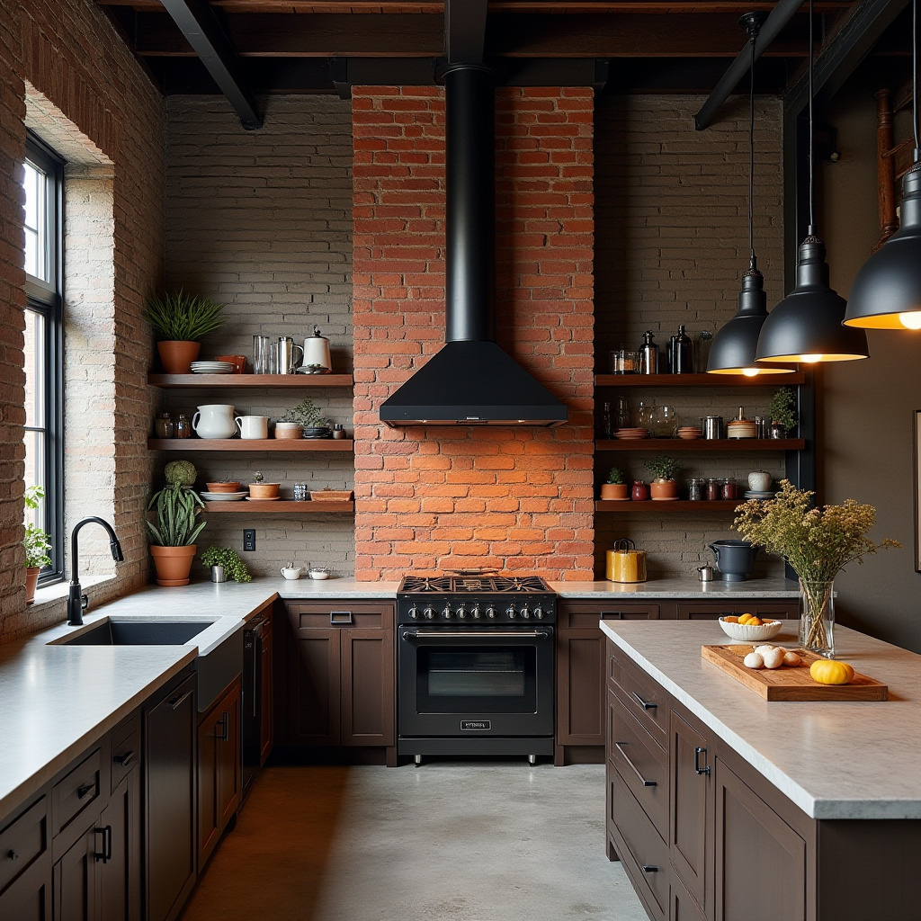
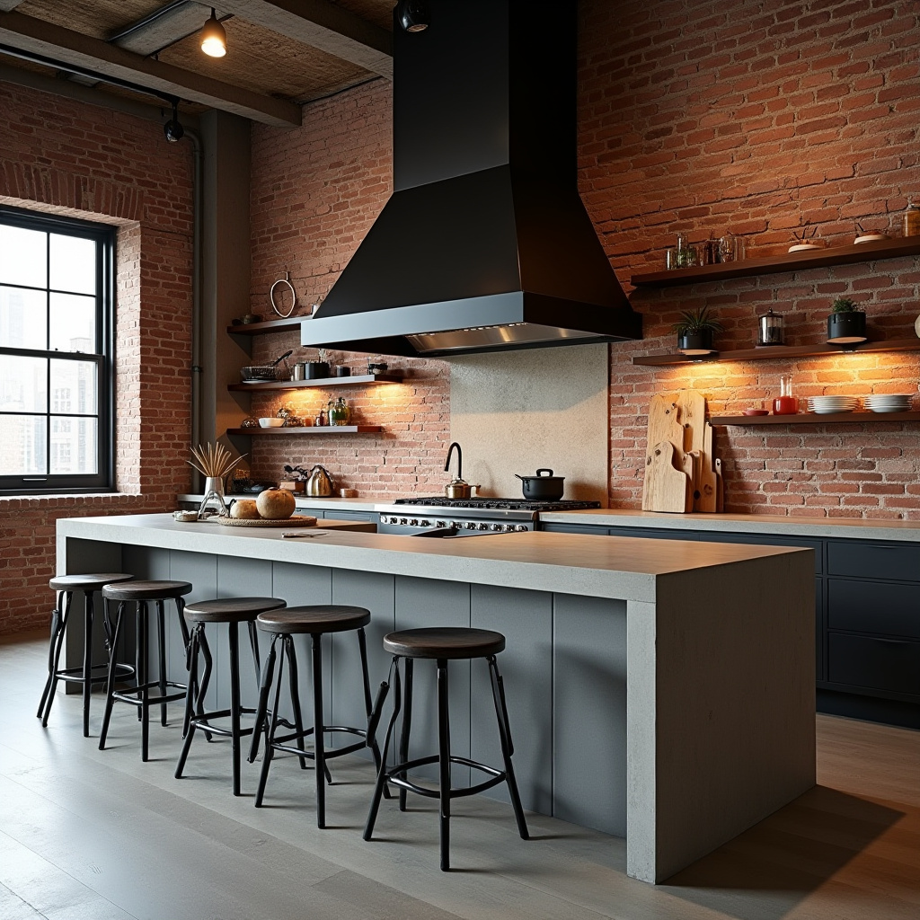
This industrial loft kitchen embraces raw textures, featuring a prominent red brick chimney that adds authenticity. The matte black metal hood contrasts sharply with concrete countertops, while industrial pendant lighting punctuates the space with character.
A reclaimed wood accent wall softens the hard surfaces, balancing the rugged materials with warmth. This design is ideal for urban dwellers who appreciate a fusion of vintage and modern elements.
- Highlight exposed brick to infuse warmth and texture.
- Choose industrial-style lighting for bold visual impact.
- Combine concrete and wood for layered materiality.
- Keep cabinetry minimal to maintain openness.
- Use open shelving to showcase curated kitchenware.
Expert Tip: Amplify the industrial feel by incorporating vintage tools or metal decor that echo the space’s workshop origins.
4. Scandinavian Kitchen with Light Wood Flooring and Soft Hues
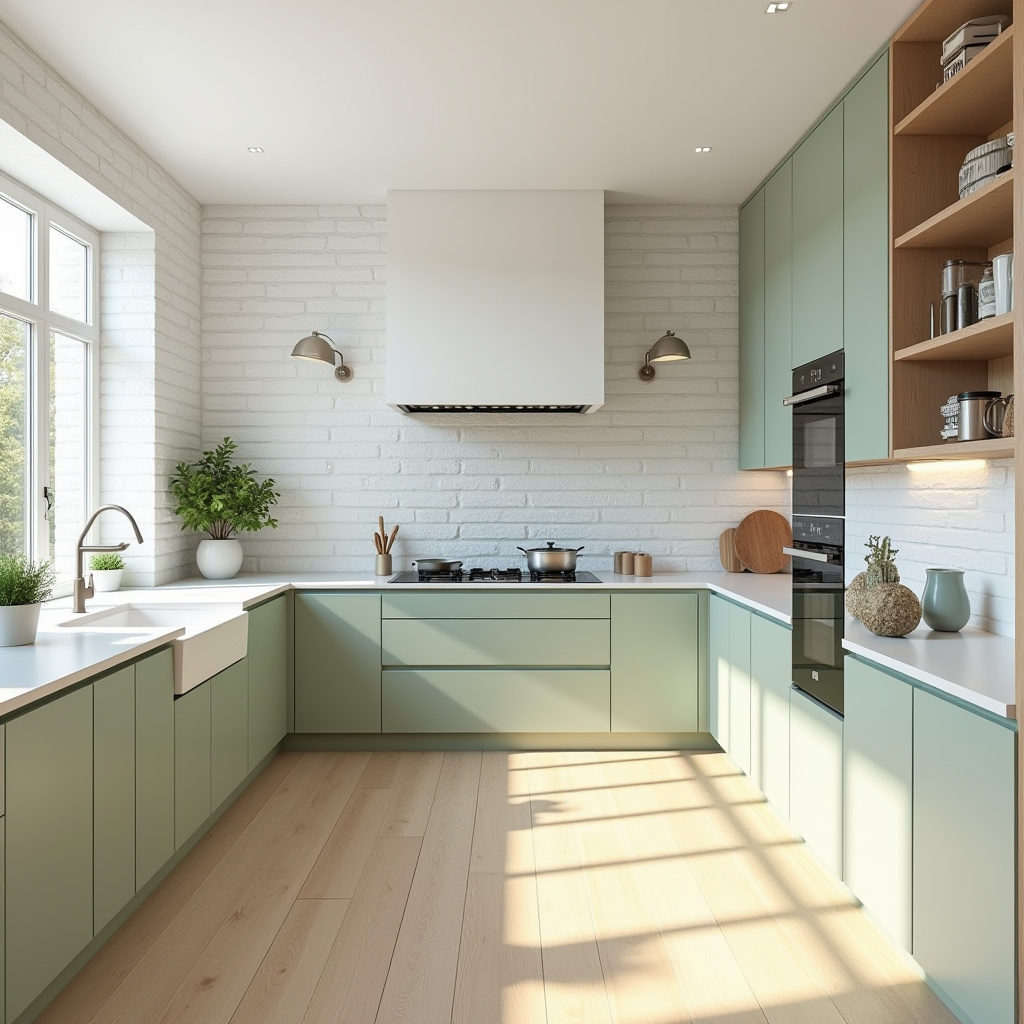
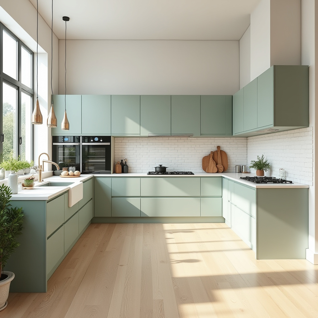
Reflecting Scandinavian design’s hallmark simplicity, this kitchen features a white brick chimney paired with soft sage cabinetry. Light wood floors add warmth, while expansive windows flood the space with natural light, enhancing its airy feel.
The muted color palette fosters tranquility, making the kitchen a serene spot for both cooking and socializing. Integrated appliances maintain the clean lines essential to this style.
- Adopt soft, neutral tones to create a peaceful environment.
- Maximize daylight with large, unobstructed windows.
- Use built-in appliances to preserve sleek surfaces.
- Choose light wood flooring for natural warmth.
- Introduce greenery to enliven the space.
Expert Tip: Incorporate natural textiles like linen or wool to add cozy layers that complement the minimalist aesthetic.
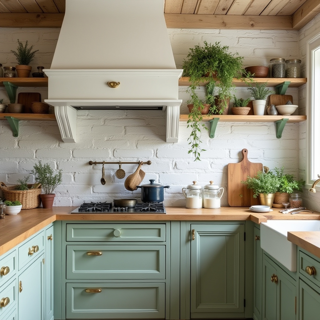
5. Mediterranean Coastal Kitchen with Terracotta Flooring
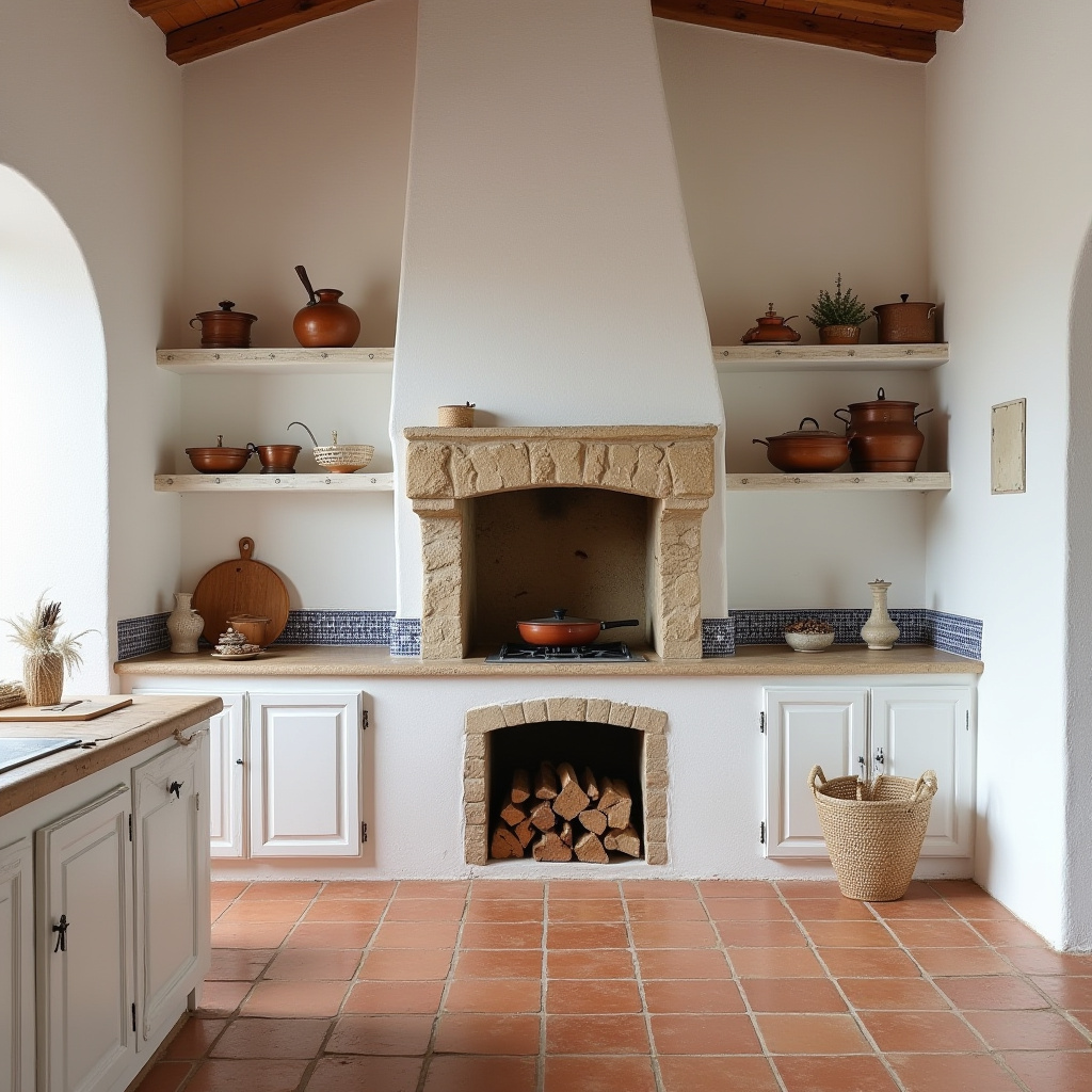
Evoking the charm of Mediterranean coastal living, this kitchen showcases terracotta floors that radiate warmth. White stucco walls and a stone chimney with a built-in wood stove create a rustic yet refined ambiance.
Blue ceramic tiles add vibrant splashes of color, while copper cookware introduces a luxurious element. The design emphasizes natural materials and textures, fostering a welcoming and relaxed atmosphere.
- Lay terracotta tiles for an inviting, earthy foundation.
- Incorporate stucco and stone for authentic Mediterranean texture.
- Add colorful tile accents to brighten the space.
- Include a wood-burning stove for ambiance and utility.
- Use open shelving to display artisanal cookware and ceramics.
Expert Tip: Enhance the coastal feel by integrating potted herbs or plants native to the Mediterranean region, which also serve culinary purposes.
6. Space-Savvy Urban Kitchen with Charcoal Grey Chimney Breast
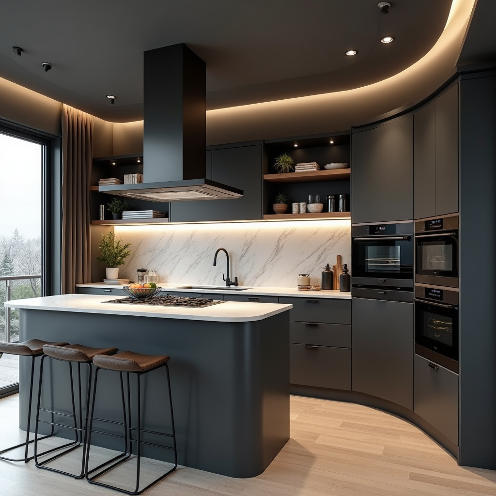
Designed for urban living, this compact kitchen maximizes every inch with smart solutions. The charcoal grey chimney breast provides a bold backdrop for floating shelves that offer open storage without crowding the space.
Smart appliances and a sleek marble backsplash add modern convenience, while a small island with integrated storage optimizes functionality. The monochromatic palette ties the design together, creating a sophisticated yet practical environment.
- Use floating shelves to keep storage accessible and airy.
- Select integrated appliances to conserve space.
- Incorporate a compact island with hidden storage.
- Maintain a cohesive monochrome color scheme.
- Employ strategic lighting to enhance the ambiance without clutter.
Expert Tip: Opt for multi-functional furniture, such as an island that doubles as a dining table, to maximize utility in limited spaces.
7. Rustic-Contemporary Kitchen with Exposed Wood Beams
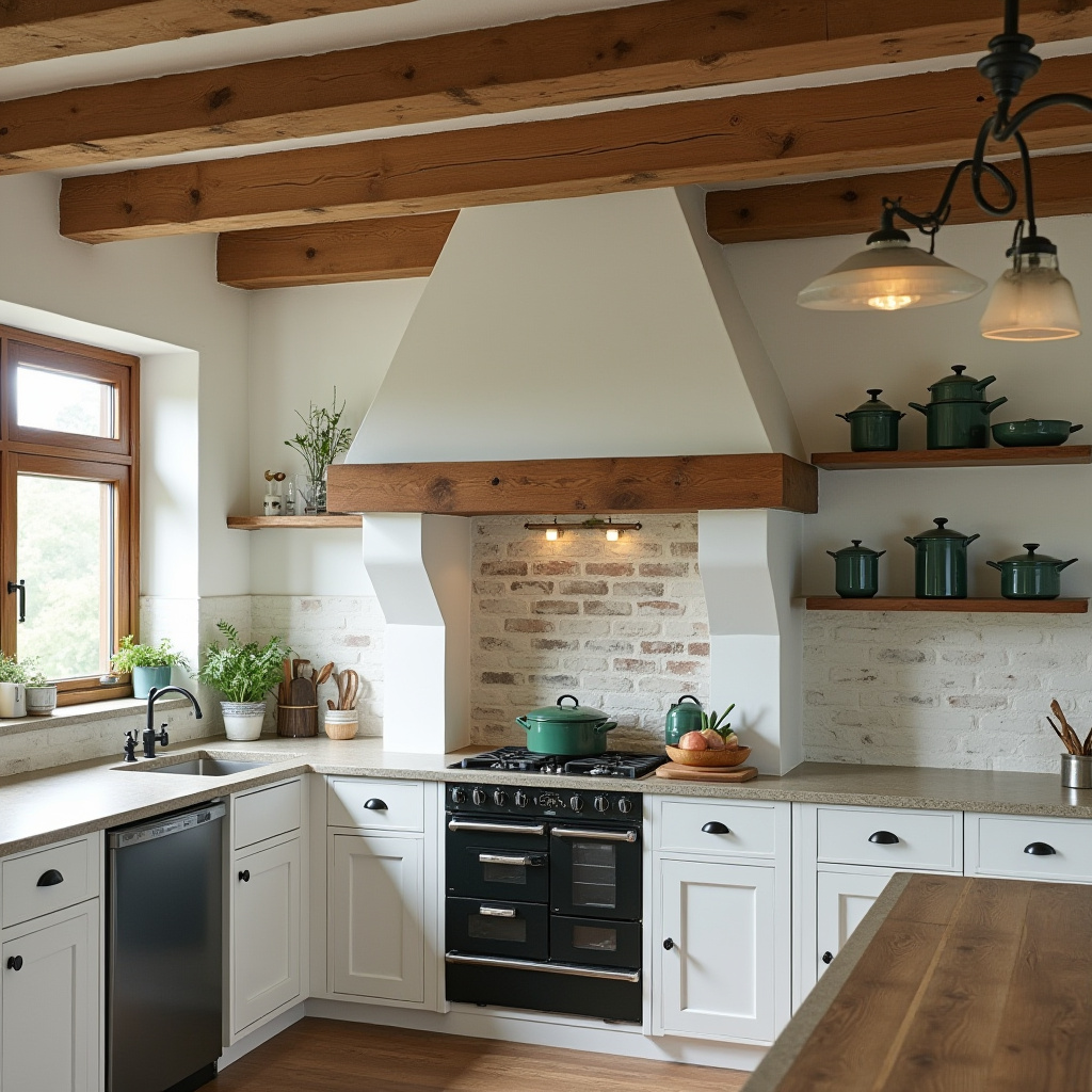
This kitchen marries rustic charm with modern elegance, featuring exposed natural wood beams that add warmth and texture. A white-painted brick chimney brightens the space, serving as a clean focal point.
Soapstone countertops lend a luxurious feel, complemented by vintage green enamel cookware that adds character. Open shelving displays beautiful dishware, while natural light enhances the inviting atmosphere.
- Highlight natural wood beams for architectural interest.
- Use white brick to create a bright, focal chimney.
- Choose soapstone surfaces for durability and style.
- Incorporate open shelving for both function and display.
- Maximize natural light to accentuate warmth.
Expert Tip: Blend traditional and contemporary decor elements to maintain a balanced rustic-modern aesthetic.
8. Farmhouse Elegance with Whitewashed Brick Chimney
Embodying the charm of country living, this farmhouse kitchen features a whitewashed brick chimney that acts as a soft, inviting centerpiece. Sage green cabinets paired with butcher block countertops create a fresh, natural palette.
Vintage brass hardware adds subtle sophistication, while hanging dried herbs contribute rustic authenticity. The space is designed to be both practical and aesthetically pleasing, perfect for culinary creativity.
- Use whitewashed brick to brighten and soften the chimney.
- Incorporate butcher block surfaces for warmth and utility.
- Add vintage brass fixtures for elegant detailing.
- Display hanging herbs for decor and cooking use.
- Create a cozy ambiance with soft lighting and curated accents.
Expert Tip: Enhance the farmhouse feel by integrating heirloom pieces and vintage finds that tell a story.
9. Contemporary Kitchen with Bold Black Chimney Hood
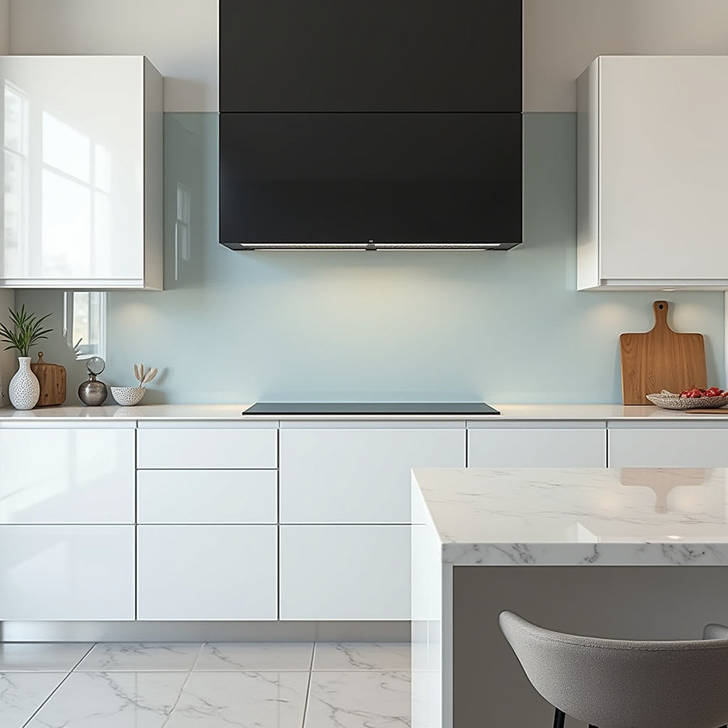
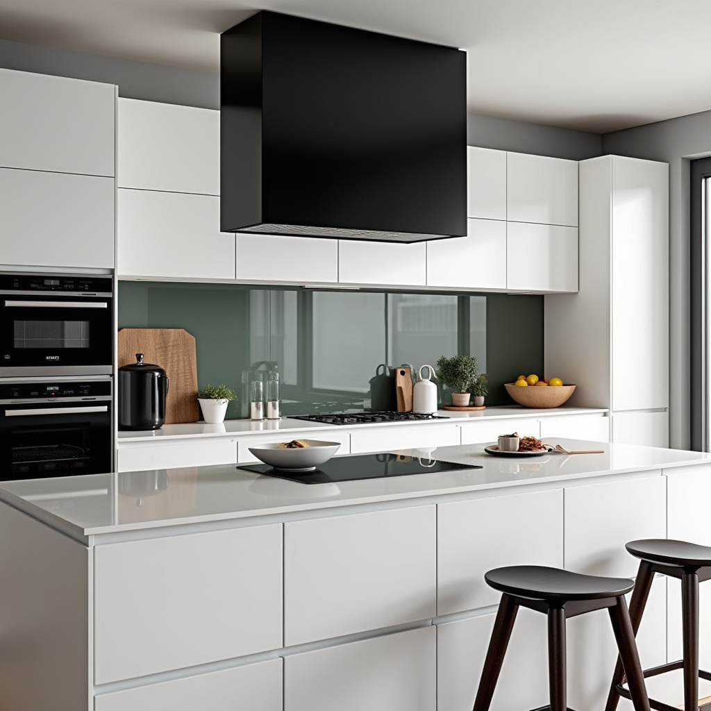
Featuring a striking black chimney hood, this contemporary kitchen exudes sophistication. Glossy white cabinets contrast sharply with the hood, while an integrated induction cooktop and glass backsplash add sleekness.
Minimalist bar stools provide functional seating without disrupting the clean lines. The monochromatic palette and geometric forms create a timeless, elegant space ideal for entertaining.
- Make a statement with a black chimney hood as the focal point.
- Choose high-gloss cabinetry for a polished, modern look.
- Integrate cooktops for seamless surfaces.
- Use minimalist seating to maintain visual clarity.
- Stick to a monochrome scheme for refined simplicity.
Expert Tip: Incorporate geometric decor and furniture to reinforce the contemporary aesthetic.
10. Vibrant Bohemian Kitchen with Exposed Brick Chimney
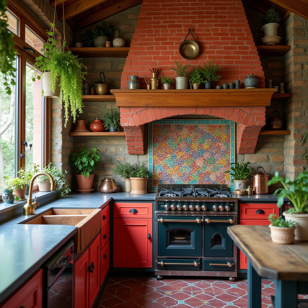
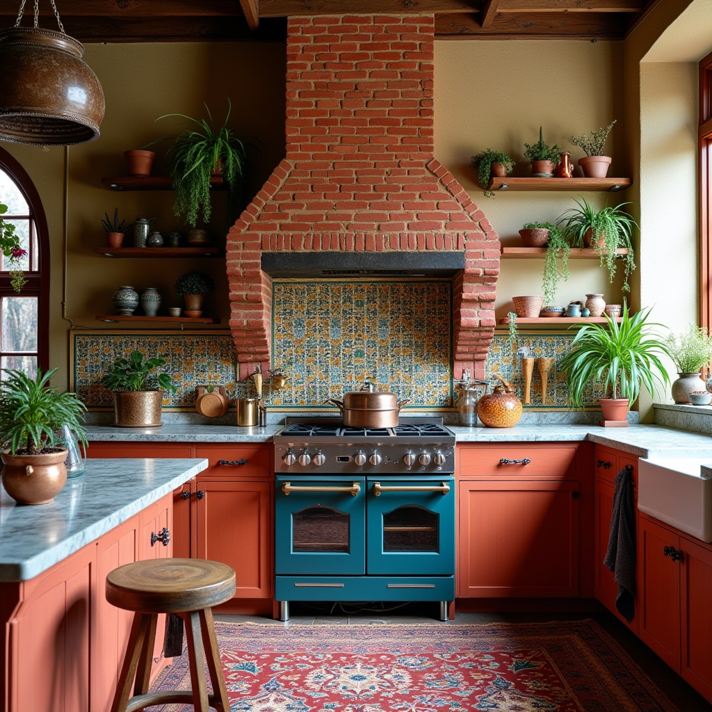
This bohemian kitchen bursts with color and texture, anchored by an exposed red brick chimney. A Moroccan tile backsplash adds a lively focal point, while open wooden shelves display hanging plants and vintage copper cookware, creating a warm, eclectic vibe.
The design encourages personal expression and creativity, making it an inspiring space for cooking and socializing.
- Use vibrant tiles to energize the kitchen’s focal area.
- Incorporate open shelving to showcase eclectic decor and greenery.
- Choose vintage cookware to add nostalgic charm.
- Mix textures and patterns for a personalized feel.
- Bring in natural elements to warm the space.
Expert Tip: Maintain cohesion by selecting a unifying color palette that ties diverse elements together.
11. Classic English Cottage Kitchen with Cream Stone Chimney
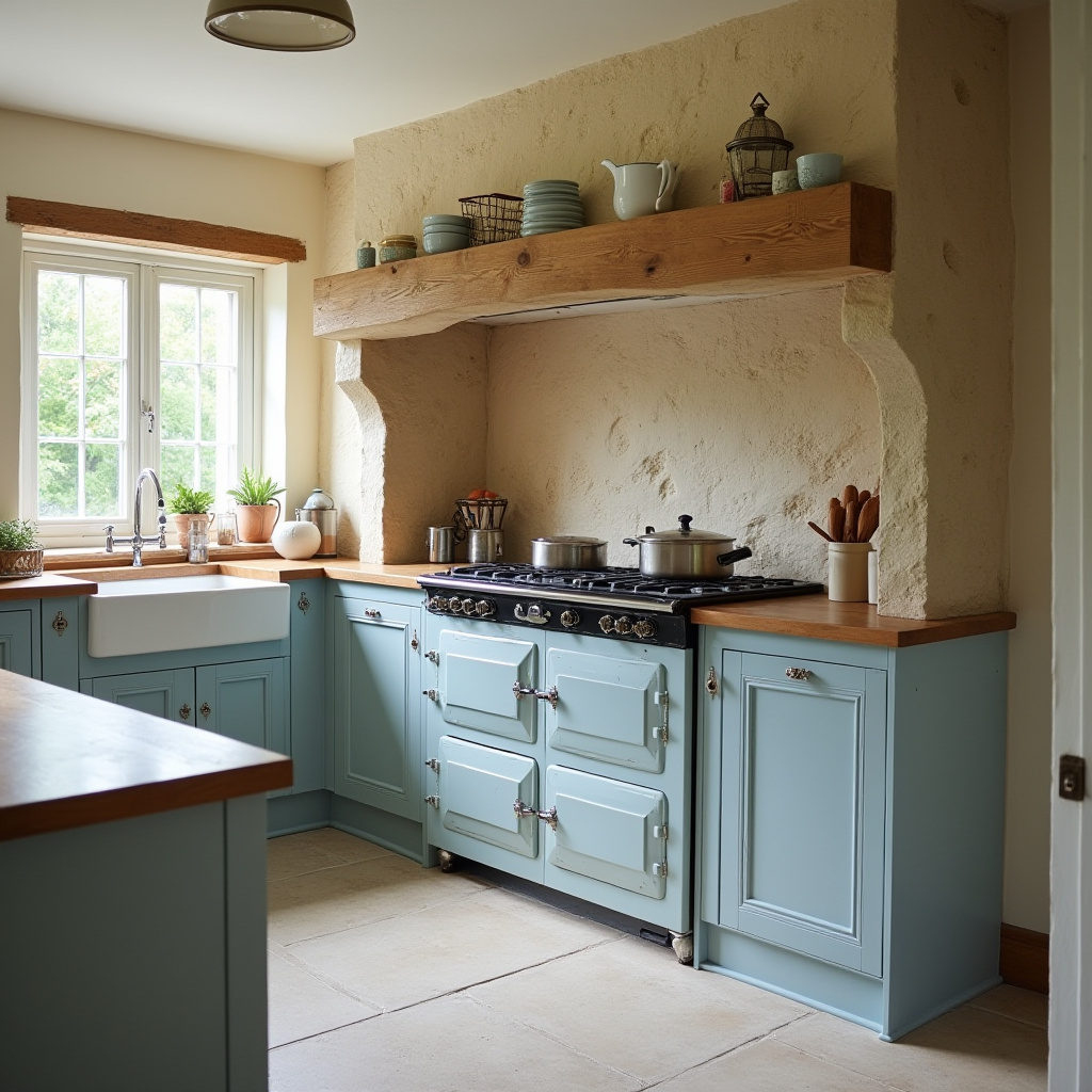
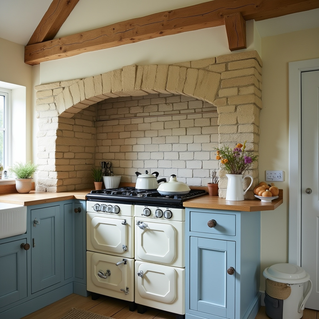
Embodying timeless rural charm, this English cottage kitchen features a cream-colored stone chimney that adds understated elegance. Wooden beams and a classic range cooker complement soft blue cabinets, creating a cozy retreat.
Natural light brightens the space, enhancing its welcoming atmosphere. The design balances tradition with modern functionality, perfect for leisurely meals and gatherings.
- Use cream stone to create a warm, inviting chimney focal point.
- Choose classic range cookers for authentic appeal.
- Incorporate wooden beams for rustic character.
- Opt for soft blue cabinetry to enhance cottage charm.
- Maximize natural light for a bright, airy feel.
Expert Tip: Select vintage ceramics and floral patterns to reinforce the traditional English aesthetic.
12. Eco-Conscious Kitchen with Recycled Brick Chimney
Championing sustainability, this kitchen features a recycled brick chimney paired with bamboo cabinetry, blending eco-friendliness with style. Concrete countertops add a modern edge, while energy-efficient appliances reduce environmental impact.
An indoor herb garden brings freshness and encourages healthy cooking. This design exemplifies how green principles can harmonize with everyday living.
- Incorporate recycled materials to minimize environmental footprint.
- Choose bamboo cabinets for sustainable elegance.
- Use concrete surfaces for durability and contemporary appeal.
- Install energy-saving appliances to boost efficiency.
- Grow an indoor herb garden for fresh ingredients and decor.
Expert Tip: Use low-VOC paints and finishes to improve indoor air quality and support a healthier home.
13. Glamorous Art Deco Kitchen with Marble Chimney Surround
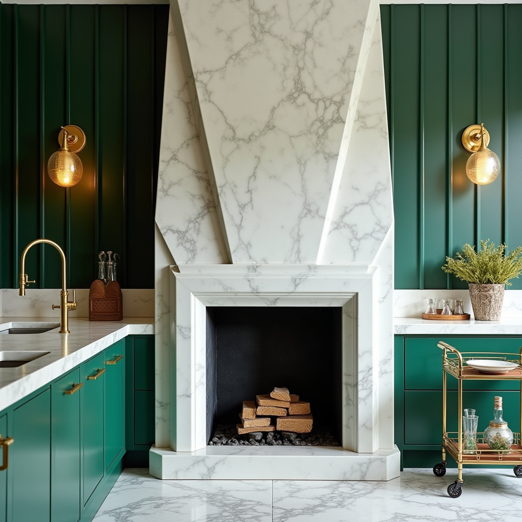
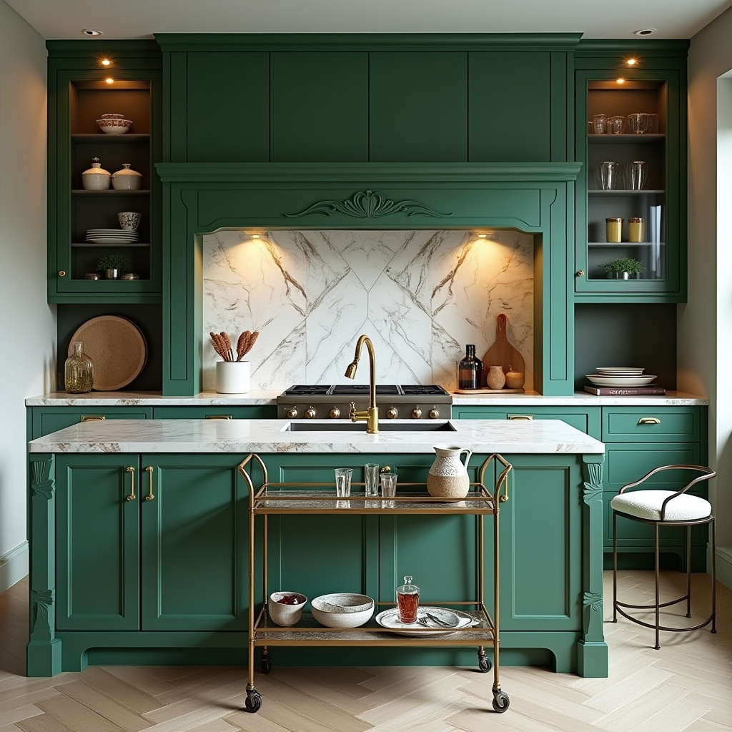
Exuding opulence, this art deco kitchen features a geometric marble chimney surround as its centerpiece. Emerald green cabinetry injects vibrant color, while brass fixtures add a touch of luxury.
A vintage bar cart and statement lighting complete the glamorous look, making the space perfect for entertaining and culinary artistry.
- Use geometric marble to create a striking, elegant focal point.
- Incorporate emerald cabinetry for bold color contrast.
- Choose brass hardware to elevate sophistication.
- Add vintage accents for character and charm.
- Install statement lighting to enhance ambiance.
Expert Tip: Integrate mirrored or metallic surfaces to amplify light and reinforce the art deco style.
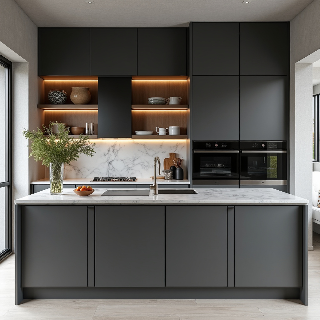
14. Serene Japanese Minimalist Kitchen with Grey Chimney
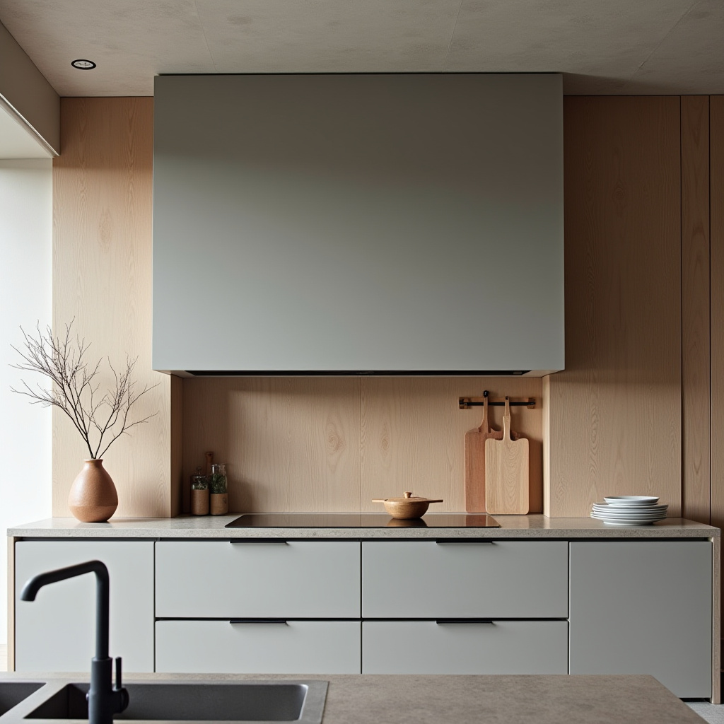
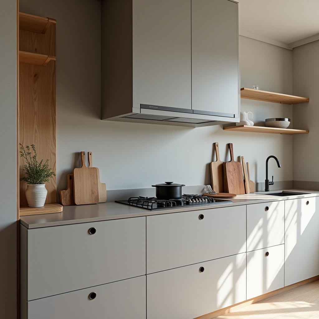
Inspired by Japanese minimalism, this kitchen emphasizes tranquility and function. A smooth grey chimney blends seamlessly with natural wood accents and built-in appliances, maintaining a clutter-free environment.
The muted color scheme and subtle textures create a peaceful atmosphere, ideal for mindful cooking and relaxation.
- Prioritize smooth, clean surfaces for simplicity.
- Incorporate natural textures to add warmth.
- Use built-in features to reduce visual clutter.
- Adopt a calming, zen-inspired color palette.
- Select purposeful decor that supports minimalism.
Expert Tip: Avoid unnecessary decorations to preserve the serene, functional aesthetic.
15. Alpine Rustic Kitchen with Natural Stone Chimney
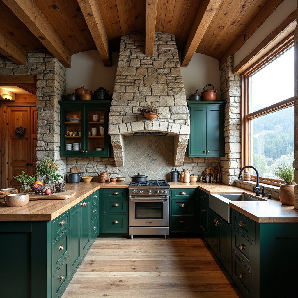
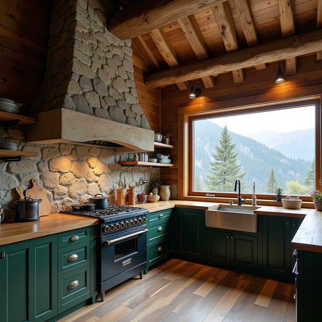
Capturing the spirit of mountain living, this alpine kitchen features a natural stone chimney and exposed wooden beams that add rustic charm. Deep green cabinets complement the natural surroundings, while a large window frames breathtaking mountain vistas.
The design fosters a connection with nature, creating a cozy and inspiring space for cooking and gathering.
- Use natural stone to create a warm, authentic chimney feature.
- Incorporate wooden beams for architectural interest and warmth.
- Choose deep green cabinetry to echo the natural landscape.
- Maximize views with expansive windows.
- Add soft textiles to enhance comfort.
Expert Tip: Decorate with nature-inspired artwork and rustic accessories to reinforce the alpine theme.
16. Tropical Modern Kitchen with White Brick Chimney
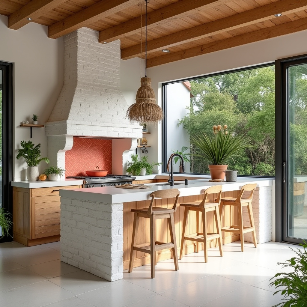
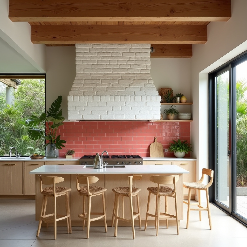
Blending indoor and outdoor living, this tropical modern kitchen features a bright white brick chimney and light wood cabinetry. Coral tile accents add playful color, while large sliding glass doors invite natural light and fresh air.
The design promotes a relaxed, breezy atmosphere perfect for entertaining and enjoying nature.
- Use white brick to create a luminous chimney focal point.
- Incorporate light wood cabinetry for an airy feel.
- Add coral accents for vibrant, tropical flair.
- Maximize natural light with expansive glass doors.
- Furnish with comfortable seating to encourage relaxation.
Expert Tip: Enhance the tropical vibe with lush potted plants and fresh herbs.
17. Retro Vintage Kitchen with Pastel Blue Chimney Breast
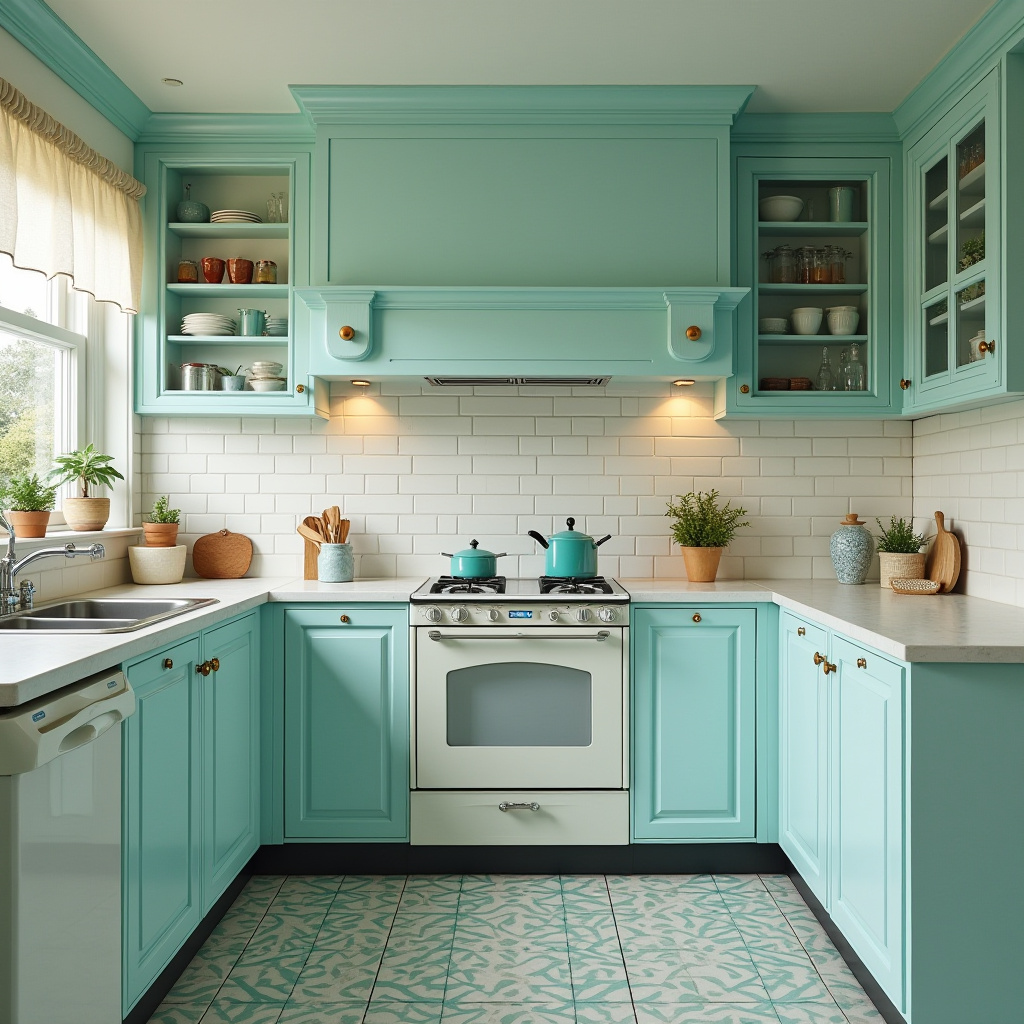
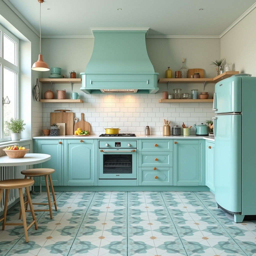
Celebrating 1950s style, this retro kitchen features a pastel blue chimney breast paired with classic white subway tiles. Mid-century modern bar stools and geometric floor patterns add playful nostalgia.
The vibrant colors and curated decor create a joyful, inviting space for cooking and entertaining.
- Use pastel hues to evoke cheerful retro charm.
- Incorporate subway tiles for timeless appeal.
- Choose mid-century furniture to reinforce the vintage vibe.
- Opt for geometric patterns to add visual interest.
- Curate playful accessories to enhance personality.
Expert Tip: Include retro appliances or decor to deepen the nostalgic atmosphere.
18. California Casual Kitchen with Whitewashed Brick Chimney
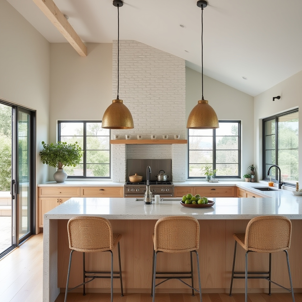
Reflecting the laid-back West Coast lifestyle, this kitchen features a whitewashed brick chimney and light oak cabinets. Terrazzo countertops add style and durability, while large windows and doors promote seamless indoor-outdoor living.
The space is bright, airy, and perfect for casual entertaining.
- Use whitewashed brick to add coastal charm.
- Choose light oak cabinetry for warmth and brightness.
- Incorporate terrazzo surfaces for durability and flair.
- Maximize natural flow with expansive windows and doors.
- Create a relaxed vibe with comfortable furnishings.
Expert Tip: Add beach-inspired decor to enhance the California casual ambiance.
19. Industrial Workshop Kitchen with Metal Chimney
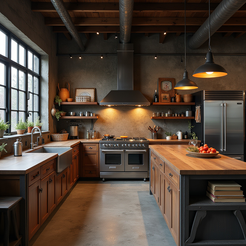
This industrial kitchen embraces a raw, utilitarian aesthetic with an exposed metal chimney. Concrete floors and reclaimed wood cabinetry create a rugged yet stylish environment, complemented by vintage industrial lighting.
Professional-grade stainless steel appliances ensure top-tier functionality, making this space ideal for serious cooks.
- Feature exposed metal for a bold industrial statement.
- Use reclaimed wood to add warmth and texture.
- Choose concrete flooring for durability and style.
- Incorporate vintage lighting to enhance the workshop feel.
- Install professional appliances for serious culinary use.
Expert Tip: Add workshop-inspired decor like tools or metal accents to reinforce the industrial theme.
20. Elegant French Provincial Kitchen with Cream Brick Chimney
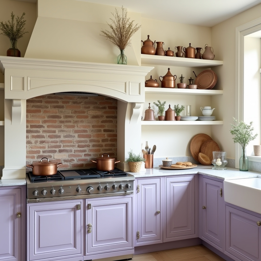
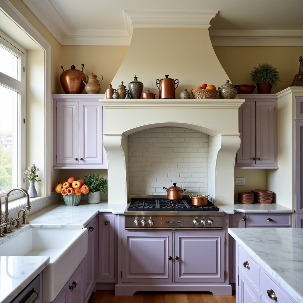
Capturing the romantic allure of French provincial style, this kitchen features a soft cream brick chimney paired with lavender cabinetry. Marble countertops add sophistication, while antique ceramics and copper cookware enhance the timeless charm.
The design balances elegance with functionality, creating an inviting space for culinary exploration.
- Use cream brick for a classic, elegant chimney feature.
- Choose lavender cabinets for a unique, charming touch.
- Incorporate marble surfaces for luxury and durability.
- Add antique accessories to enrich the romantic ambiance.
- Maximize natural light to warm the space.
Expert Tip: Introduce floral patterns and soft textiles to deepen the French provincial atmosphere.
In summary, chimneys can serve as captivating focal points in kitchens, enhancing both style and utility. From rustic to modern, these 20 design ideas demonstrate the versatility and charm chimneys bring to culinary spaces.
As you consider these inspirations, feel empowered to experiment with materials, colors, and layouts to craft a kitchen that truly reflects your personality and lifestyle. Your dream kitchen awaits!