Step into a world where color tells a story, texture invites touch, and every piece speaks to a carefully curated vision. Crafting an eclectic living room filled with rich, vibrant hues is an art-one that balances boldness with harmony, chaos with intention. This space becomes more than just a room; it transforms into a canvas of personality, where diverse styles and cultures converge in a symphony of color and form. In this article, we explore the delicate dance of designing a vibrant harmony, offering insights and inspiration for bringing together eclectic elements that celebrate richness without overwhelming. Whether you’re drawn to jewel tones, deep earth shades, or unexpected pops of brightness, discover how to weave these colors into a living room that is as inviting as it is dynamic.
Vibrant Color Palette Blending Jewel Tones and Earthy Hues for an Eclectic Living Room Atmosphere
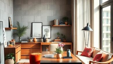
Incorporating a vibrant color palette that blends jewel tones with earthy hues offers an invigorating yet grounding foundation for your living room. The deep emerald greens, amethyst purples, and sapphire blues introduce a lush, regal quality to the space, while warm terracotta, ochre, and muted browns anchor the overall design with natural warmth. This harmonious juxtaposition allows you to craft a room that feels both luxurious and inviting, creating a dynamic visual tapestry that is anything but ordinary.
To achieve a balanced eclectic atmosphere, consider layering textures and finishes that accentuate the color story. Here’s a simple guide for pairing tones and textures:
- Jewel Tones: Velvet cushions, silk drapes, and glossy ceramics to enhance richness.
- Earthy Hues: Linen throws, woven baskets, and matte wood finishes to introduce organic charm.
| Color Category | Ideal Textures | Suggested Decor Elements |
|---|---|---|
| Jewel Tones | Velvet, Satin, Glass | Throw pillows, vases, statement lamps |
| Earthy Hues | Linen, Wicker, Matte Wood | Area rugs, baskets, rustic shelving |
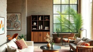
Mixing Vintage and Modern Furniture Styles with Bold, Rich Upholstery to Create Visual Contrast
In the realm of interior design, pairing vintage furniture with modern pieces woven together by bold, rich upholstery adds an unexpected layer of depth and personality to your living room. Imagine a plush, emerald velvet sofa with tufted details resting beside a sleek mid-century modern armchair upholstered in deep sapphire blue. This blend of tradition and contemporary flair creates a dynamic visual conversation, where each piece enhances the other rather than competes. The texture and color saturation in the upholstery act as a bridge, harmonizing different eras into a cohesive story that invites both comfort and admiration.
To successfully execute this eclectic mix, focus on color saturation and fabric quality as the unifying elements. Use vibrant upholstery fabrics such as crushed velvet, brocade, or leather in jewel tones to anchor your furniture choices. Incorporate these key points for balanced contrast:
- Choose upholstery colors with similar warmth or coolness to maintain harmony.
- Mix rounded vintage silhouettes with modern angular frames for visual intrigue.
- Add textured pillows and throws in complementary hues to soften transitions.
- Use metallic accents on side tables or lamps to elevate richness and tie looks together.
| Furniture Style | Upholstery Fabric | Suggested Colors |
|---|---|---|
| Vintage | Velvet | Emerald Green, Burgundy |
| Modern | Leather / Linen Blend | Deep Navy, Charcoal |
| Eclectic Accent | Brocade / Patterned | Gold, Teal, Rust |
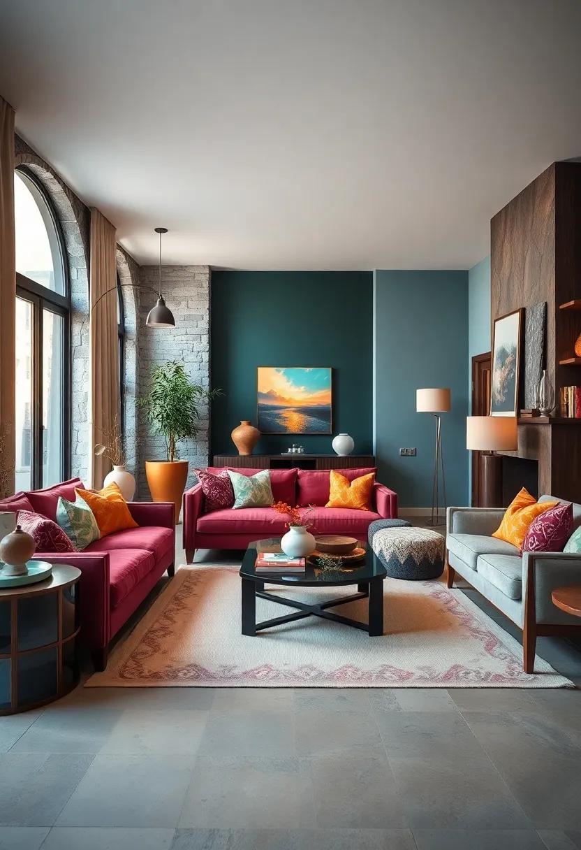
Layering Textures Through Plush Rugs, Soft Throws, and Velvet Cushions in Warm, Saturated Colors
Infusing your living room with layers of tactile richness transforms the space into a cozy haven that invites touch and admiration. Plush rugs underfoot offer a foundational warmth, their soft fibers amplifying the room’s comfort while grounding the vibrant palette. Draped softly over a sofa or chair, throws in velvety textures add a casual, approachable elegance. By choosing these elements in warm, saturated hues-think deep maroons, burnt oranges, and golden yellows-you create a comforting embrace of color that feels both lively and soothing.
Velvet cushions punctuate the scene with bursts of texture and depth, their sheen catching light to highlight the room’s eclectic charm. When mixed in eclectic shapes and sizes, these cushions become more than décor-they serve as a dynamic conversation piece, inviting guests to sink into their plush embrace. To achieve a balanced layering effect, consider this simple guide:
- Start with a neutral base rug to anchor the space while providing softness.
- Add throws in complementary warm shades with tactile patterns.
- Mix velvet cushions in varying tones and contours to play with light and shadow.
| Texture | Material | Color Suggestions |
|---|---|---|
| Rug | Wool plush | Rust, Deep Bronze |
| Throws | Cotton velvet | Ochre, Burgundy |
| Cushions | Velvet blend | Mustard, Mahogany |
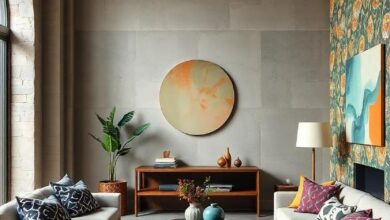
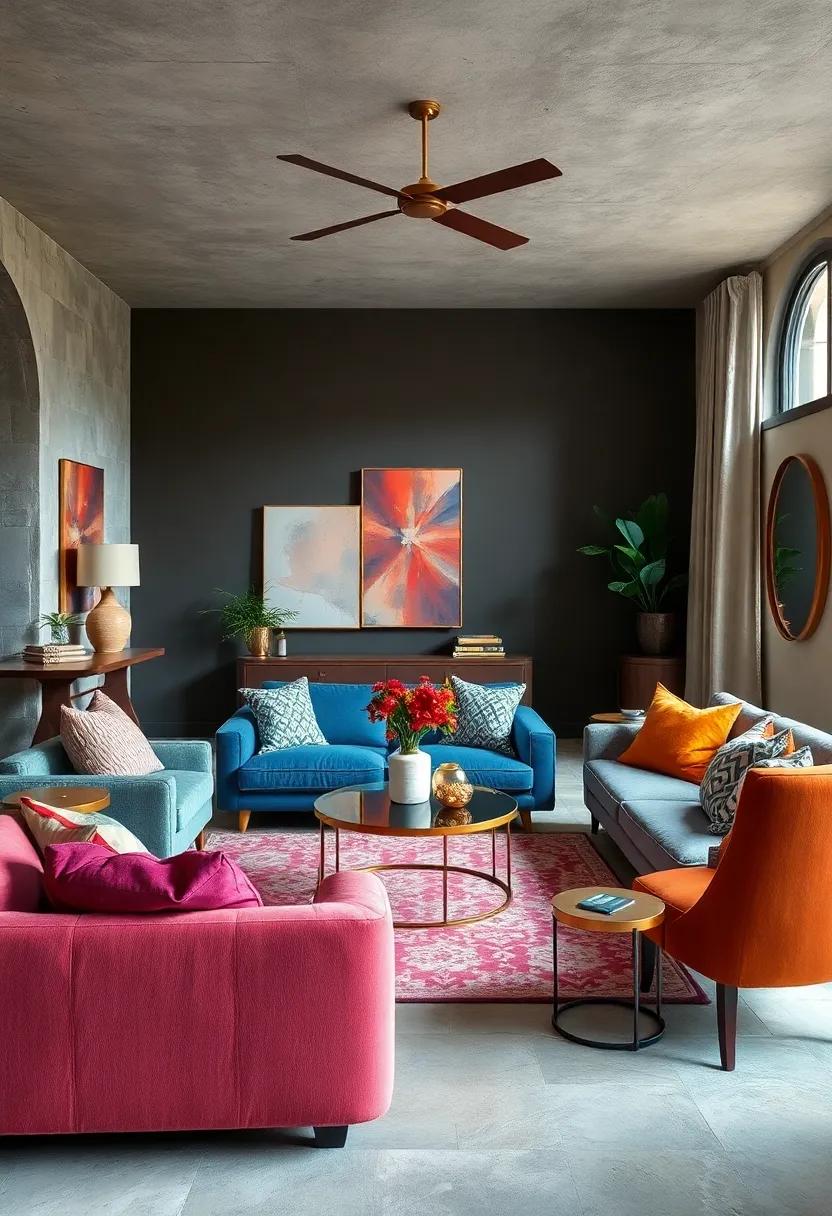
Showcasing Artistic Wall Murals with Abstract Patterns in Deep Reds, Blues, and Golden Accents
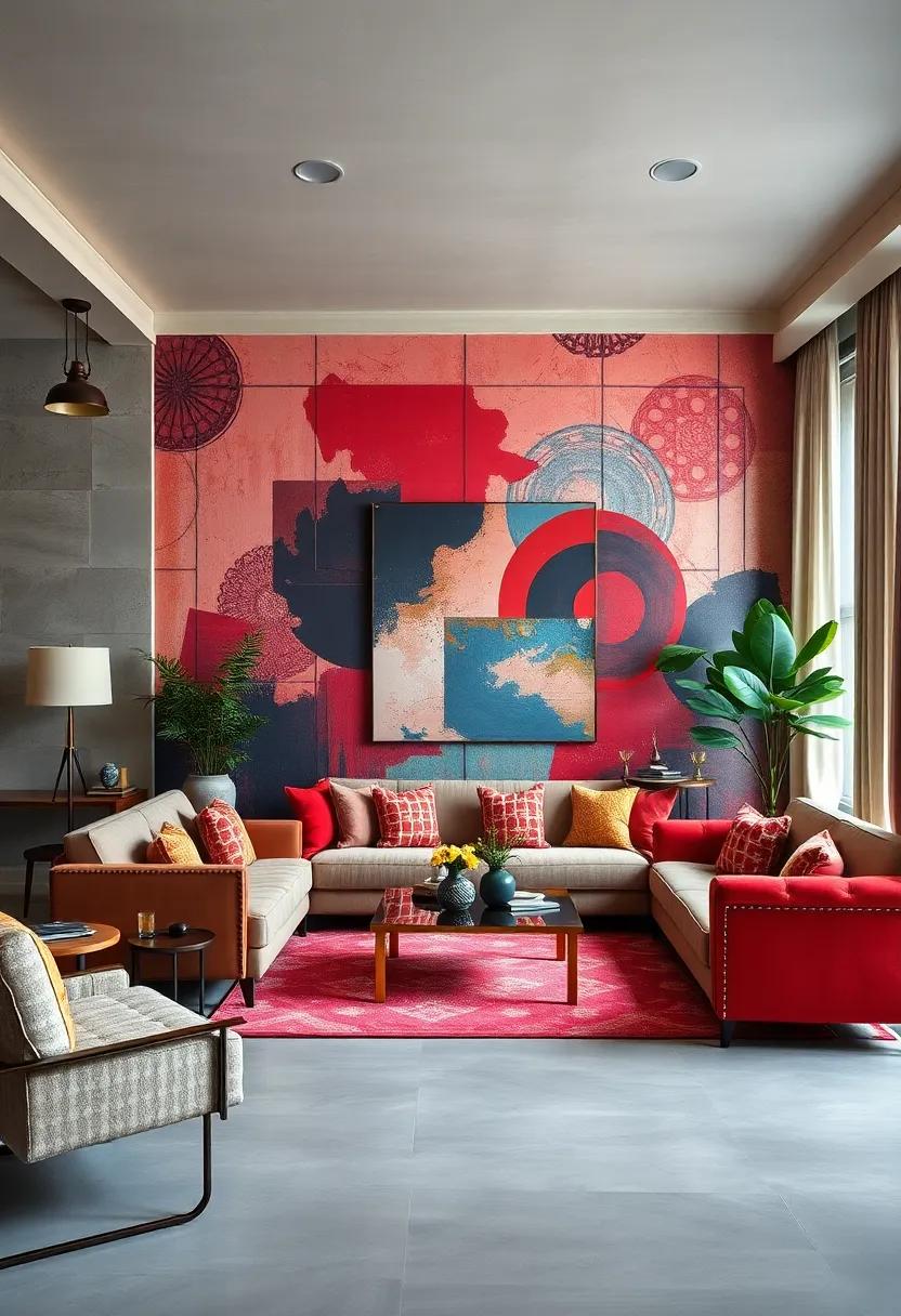
Walls come alive when brushed with an artistic vision that plays on contrast and depth. Abstract patterns in deep reds, vibrant blues, and touches of golden accents create an inviting energy, establishing a dynamic backdrop that transcends traditional decor boundaries. The interplay of these rich hues invites the eye to wander, making the walls not just a background but the soul of the living room. Whether sweeping strokes or geometric fragments, the mural’s design balances boldness with elegance, fostering a space where creativity and comfort merge effortlessly.
To complement such a spirited centerpiece, consider incorporating furniture and accessories that echo the mural’s palette without overpowering it. Here’s a quick guide to balance this electric ambiance:
- Velvet cushions in muted blues and warm reds
- Brass or antique gold accents on lamps and side tables
- Textured rugs in neutral tones with subtle patterns
- Minimalistic shelving to avoid clutter and highlight the walls
| Color | Effect | Recommended Element |
|---|---|---|
| Deep Red | Warmth & Passion | Accent pillows & throws |
| Vibrant Blue | Calmness & Depth | Artwork frames & vases |
| Golden Accents | Glamour & Light | Lamps & decorative trays |
Incorporating Brass and Copper Metallic Elements to Add Warmth and Reflective Light
Brass and copper accents serve as transformative elements, effortlessly infusing warmth and sophistication into any eclectic living room. Their rich, golden hues not only complement vibrant color palettes but also introduce a subtle shimmer that dances with natural and artificial light. Incorporate these metals through statement lighting fixtures like pendant lamps or sconces, which cast a welcoming glow, or choose side tables and decor pieces that offer a tactile contrast against plush textiles and painted walls. Their reflective quality brightens corners, making the space feel both intimate and expansive.
To balance these luxurious metals without overwhelming the space, consider integrating them with softer textures and colors. Here are a few ideas:
- Mix Matte and Shine: Pair polished copper bowls with matte ceramic vases for textural intrigue.
- Layer Metallics: Combine brass frames with copper candle holders, creating visual interest through varied metal tones.
- Strategic Placement: Use metallic accents to highlight focal points, such as mantelpieces or shelves.
| Metal Element | Suggested Use | Effect |
|---|---|---|
| Brass | Light Fixtures | Warm Ambient Glow |
| Copper | Decorative Bowls & Trays | Reflective Warmth |
| Mixed Metals | Picture Frames | Eclectic Layering |
Balancing Bright Accent Pieces Against Dark Wood Furnishings for a Grounded Yet Lively Space
Incorporating bright accent pieces into a room anchored by dark wood furnishings requires a mindful approach to avoid overwhelming the senses. Start by selecting colors that offer contrast yet complement the deep, warm tones of the wood. Think of rich emeralds, vibrant corals, or sunny yellows that breathe life into the space while maintaining an inviting atmosphere. Use these hues sparingly through pillows, throw blankets, or small decorative objects to create playful sparks of color that draw the eye without dethroning the furniture’s grounded charm.
To create a cohesive balance, layer textures and materials alongside color choices. Consider mixing plush fabrics like velvet or silk for accent cushions with the organic, sturdy feel of wood. Here’s a quick guide to harmonizing elements:
- Accent colors: Bright but warm shades such as mustard, ruby, or teal.
- Materials: Soft textiles paired with natural fibers like jute or wool.
- Patterns: Subtle geometrics or florals that add intrigue without clashing.
| Accent Piece | Recommended Color | Texture Highlight |
|---|---|---|
| Cushions | Sunset Orange | Velvet |
| Vases | Emerald Green | Glossy Ceramic |
| Rugs | Deep Blue | Wool |
| Lampshades | Ruby Red | Silk |
Arranging Indoor Plants in Colorful Pots to Infuse Fresh Greenery Alongside Vibrant Surroundings
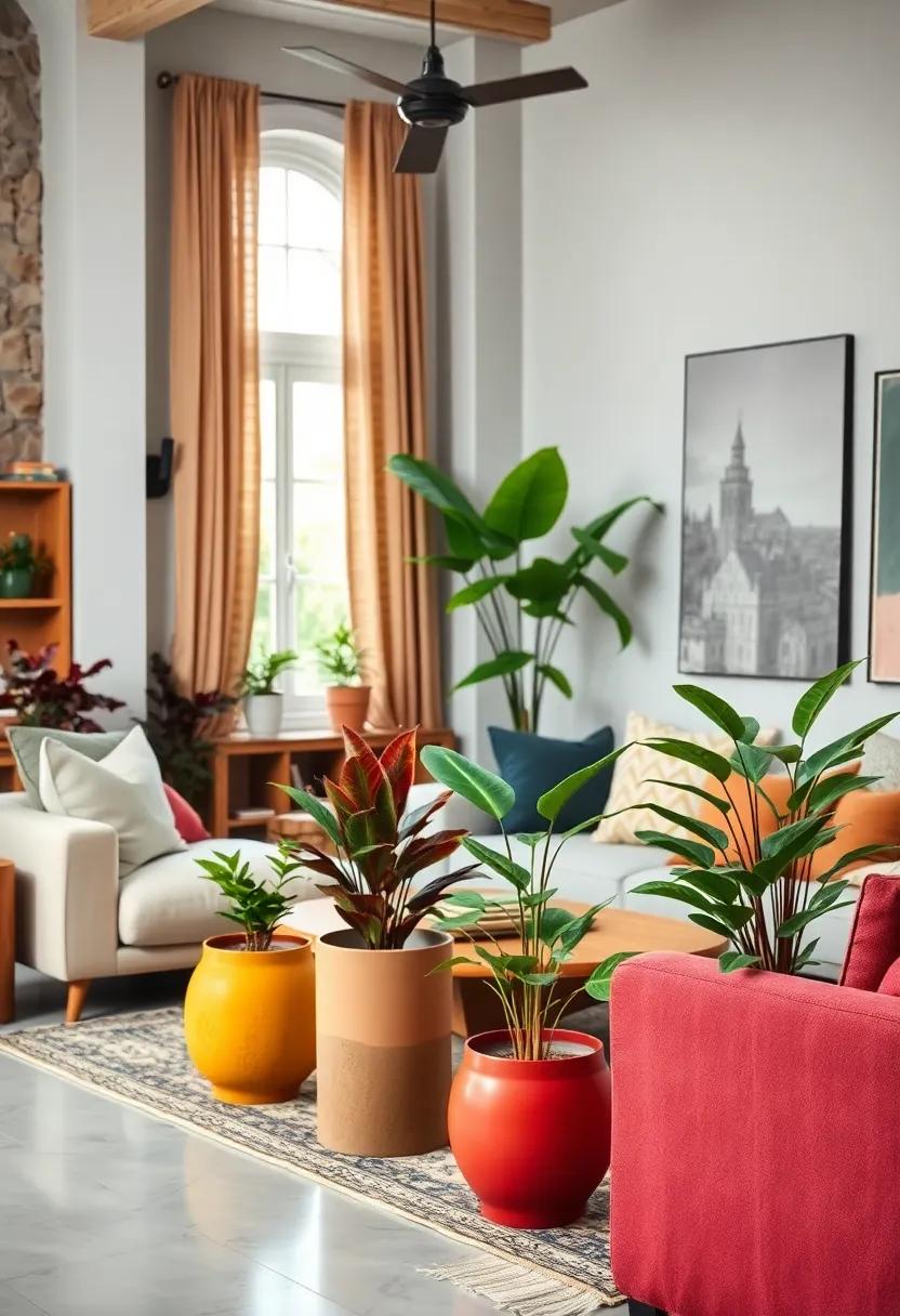
Integrating indoor plants with pots painted in bright, contrasting hues breathes life into any living space, crafting an atmosphere where nature and color coalesce effortlessly. When selecting pots, consider shades like deep turquoise, fiery coral, or sunny yellow to accentuate the green foliage while adding a playful visual rhythm. Grouping these pots at varying heights not only introduces depth but creates a dynamic tableau that invites both the eye and spirit to wander and explore. The tactile texture of ceramic or terracotta pots further enriches this multisensory experience, amplifying the vibrancy of your eclectic environment.
To maximize impact, try arranging your plants according to these vibrant duo combinations:
- Ruby red pots paired with delicate ferns for a lush, romantic feel.
- Mustard yellow containers housing succulent plants, creating sunny islands of resilience.
- Cobalt blue vessels cradling trailing ivy, perfect for a serene yet lively ambiance.
| Pot Color | Plant Type | Vibe Created |
|---|---|---|
| Coral | Snake Plant | Warmth & Energy |
| Eggplant Purple | Pothos | Richness & Depth |
| Bright Lime | Spider Plant | Freshness & Playfulness |
Displaying Eclectic Collections of Decorative Objects with Varied Shapes and Rich Color Finishes
Embracing a mix of shapes and finishes in your decorative objects invites a dynamic energy that breathes life into any living space. Imagine a captivating vignette where sculptural ceramic vases with glossy jewel tones sit alongside matte-finished wooden bowls carved in organic, asymmetrical forms. This eclectic approach not only draws the eye but also creates a tactile richness, with each piece telling its own story through texture and color. The layering of curves, angles, and varying heights crafts a visual rhythm, turning simple decor into a vibrant conversation starter.
To master this curated look, consider the following essential elements:
- Contrasting Textures: Pair smooth, lacquered surfaces with rough, handcrafted finishes to enhance depth.
- Varied Silhouettes: Mix tall, slender shapes with stout, rounded forms for balance and intrigue.
- Color Layering: Incorporate rich, saturated hues such as deep emerald, burnt sienna, and sapphire blue to unify the ensemble.
| Object Type | Finish | Color Palette |
|---|---|---|
| Sculptural Vase | Glossy Ceramic | Emerald Green |
| Decorative Bowl | Matte Wood | Burnt Sienna |
| Abstract Figurine | Metallic Bronze | Sapphire Blue |
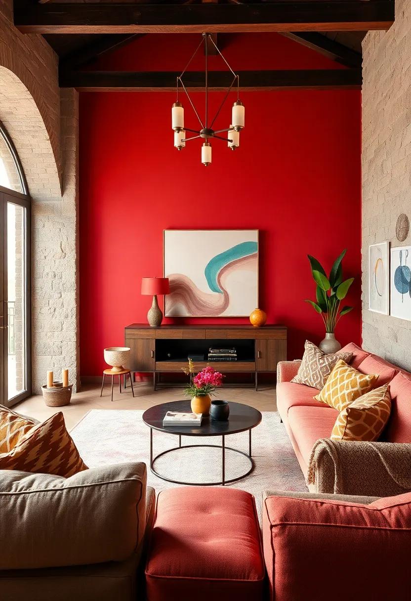
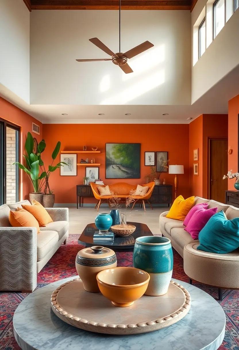
Creating a Statement Ceiling with Bold Wallpaper or Painted Patterns in Complementary Hues
Elevate your living room’s ambiance by transforming the ceiling into a captivating canvas that commands attention. Using bold wallpaper or intricately painted patterns in hues that harmonize with your walls introduces depth and personality overhead. This technique not only breaks the monotony of traditional white ceilings but also balances the vibrancy below, creating a seamless flow of color that leads the eye upward. Opt for deep jewel tones or rich earthy pigments that complement your existing palette to ensure a cohesive yet eclectic vibe.
When selecting patterns or prints, consider these creative approaches:
- Geometric designs to lend a modern, structured feel while maintaining dynamism.
- Organic motifs like florals or vines for a touch of whimsy and softness.
- Abstract art that serves as a surprising focal point, stimulating conversation.
| Wallpaper/Pattern Type | Color Palette | Visual Effect |
|---|---|---|
| Bold Floral | Deep Greens & Golds | Luxurious & Vibrant |
| Abstract Brushstrokes | Coral & Teal | Energetic & Contemporary |
| Geometric Lines | Charcoal & Mustard | Modern & Crisp |
Using Layered Lighting Fixtures Including Vintage Lamps and Modern Chandeliers to Enhance Color Depth
Achieving a dynamic and inviting atmosphere in your eclectic living room largely depends on how you manipulate light to play off the deep, vibrant hues of your decor. Layered lighting offers an outstanding strategy, combining the warmth of vintage lamps with the sleek allure of modern chandeliers. Vintage lamps, with their amber glow and textured shades, introduce a soft, intimate ambiance that enhances the richness of jewel tones and earthy palettes. Meanwhile, modern chandeliers act as focal points, scattering light across walls and color-rich furnishings to create a multidimensional effect that emphasizes texture and depth.
Consider implementing a balanced blend of lighting layers to complement each other and elevate your color scheme:
- Ambient light: Use ceiling-mounted modern chandeliers with adjustable brightness to evenly illuminate the room and highlight overall color saturation.
- Task lighting: Place vintage lamps near reading nooks or seating areas for cozy, focused light that brings out subtle color gradations.
- Accent lighting: Add directional spotlights or wall sconces to emphasize art or color accents, creating contrast and depth.
This thoughtful combination not only maximizes visual interest but also nurtures a harmonious balance between old-world charm and contemporary elegance within your living space.
| Lighting Type | Effect on Color | Ideal Placement |
|---|---|---|
| Vintage Lamps | Soft warmth, enhances earthy and jewel tones | Side tables, corners, reading spots |
| Modern Chandeliers | Crisp illumination, highlights overall palette | Ceiling center, over coffee tables |
| Accent Spotlights | Creates contrast, sharpens details | Artwork walls, architectural features |
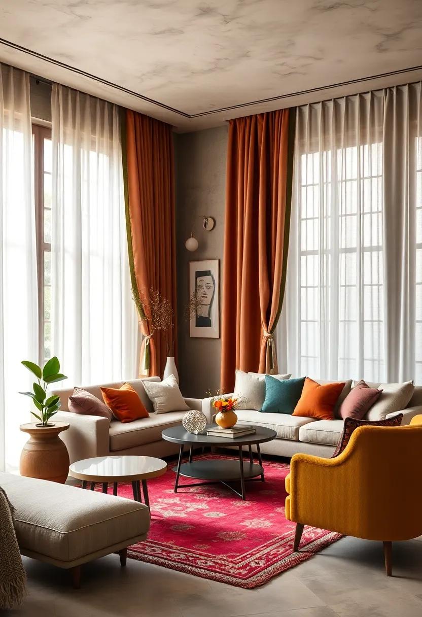
Integrating Color-blocked Curtains with Gradient Shades that Compliment the Room’s Rich Tones
Pairing color-blocked curtains with gradient shades provides a dynamic layering effect that can elevate the eclectic vibe of your living room. By choosing fabrics that echo the room’s deep jewel tones-such as emerald greens, sapphire blues, or rich burgundies-you create a seamless integration of textures and hues. This approach balances bold, solid color blocking with the subtle shifts of gradient, allowing the curtains to serve as both a statement piece and a soft visual transition. To maintain harmony, consider placing the darker gradient end towards areas with ample natural light, which helps to amplify the richness of the fabric colors without overwhelming the space.
When selecting gradient shades, keep in mind these key considerations for optimal impact:
- Complementary Base Tones: Match gradients with primary room colors to enhance cohesion.
- Fabric Texture: Cotton blends and linen support depth, while silk or velvet add luxurious sheen.
- Light Control: Gradients can transition from sheer to opaque, adding functional versatility.
- Balance & Scale: Larger blocks paired with fine gradients prevent visual clutter.
To provide a clearer illustration, here’s a simple pairing guide that echoes these principles:
| Color Block | Gradient Shade | Recommended Fabric |
|---|---|---|
| Burnt Orange | Peach to Deep Coral | Silk Velvet |
| Navy Blue | Royal Blue to Pale Blue | Heavy Linen |
| Mustard Yellow | Goldenrod to Cream | Cotton Blend |
| Forest Green | Moss to Sage | Sheer Linen |
Introducing Textured Wall Panels Featuring Intricate Designs in Warm, Saturated Colors
Transform your living space by incorporating panels that offer a tactile and visual feast. These unique wall features often showcase intricate carvings or embossed patterns, inviting you to run your fingers over the depth and texture. The warmth of saturated colors like burnt sienna, deep marigold, and rich terracotta brings a cozy, inviting aura, making every inch of your living room feel thoughtfully curated. Not only do these panels serve as stunning focal points, but they also harmonize beautifully with neutral furniture and vibrant accents, creating a layered, eclectic look that’s anything but ordinary.
Choosing the right combination of materials and hues is key to balance and flow. Here are some ideas to inspire your next project:
- Wooden panels with a matte finish paired with jewel-toned fabrics add rustic elegance.
- Ceramic-textured panels in warm shades complement metallic accessories for a modern touch.
- Fabric-wrapped panels infused with saturated colors soften geometric patterns, enhancing comfort and style.
| Panel Material | Suggested Color Palette | Complementary Decor |
|---|---|---|
| Carved Wood | Burnt Sienna, Mustard Yellow | Leather cushions, Brass lamps |
| Pressed Metal | Copper, Deep Olive | Textured rugs, Ceramic vases |
| Fabric Panels | Ruby Red, Soft Tangerine | Patterned throws, Wooden coffee tables |
Selecting Area Rugs with Ethnic Patterns and Multicolor Weaves to Anchor the Eclectic Theme
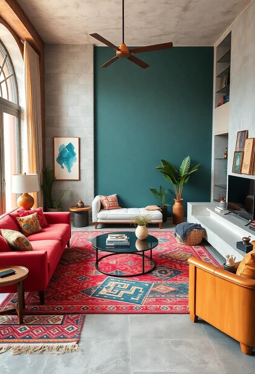
When choosing rugs that truly resonate with an eclectic aesthetic, look for those featuring ethnic patterns that tell a story. These rugs serve as visual anchors, grounding your space with their intricate designs and cultural richness. Whether opt for Moroccan Berber motifs, vibrant Kilim geometric shapes, or bold Persian florals, the key is to embrace authenticity and texture. Multicolor weaves bring playful energy and unexpected harmony to your living room, weaving together diverse elements effortlessly.
Consider these vital points to elevate your selection:
- Palette Variety: Rugs with a broad spectrum of hues allow flexible pairing with furnishings and accessories.
- Layering Potential: Ethnic rugs can be layered over neutral carpets for depth and warmth.
- Material Blend: Handwoven wool or silk blends add luxury and tactile contrast.
- Size & Shape: Opt for sizes that frame your seating arrangement and shapes that add visual interest, like round or runner styles.
Designing Cozy Reading Nooks with Plush Chairs in Deep Burgundy or Emerald Green Velvet
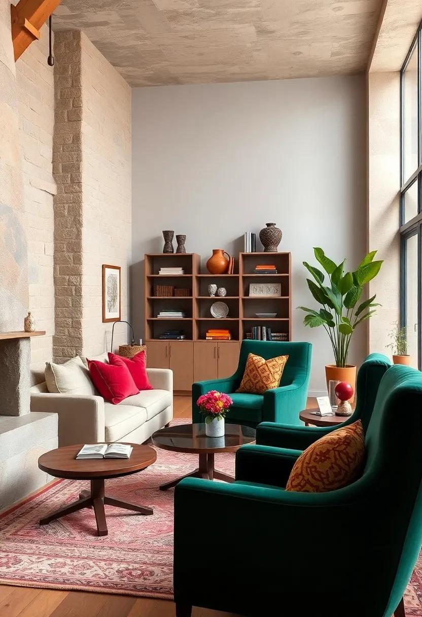
Anchor your reading nook with a plush velvet chair in sumptuous shades of deep burgundy or emerald green, transforming any corner into a sanctuary of comfort and elegance. These rich hues not only add depth but also create a tactile richness that invites you to sink in and escape into your favorite book. Pair the chair with warm wooden accents and soft, textured throws to enhance the coziness factor, while a rustic floor lamp or a sleek brass reading light provides the perfect illumination for those long reading sessions.
To complete the look, consider layering in subtle eclectic elements that harmonize with the bold velvet statement piece:
- Mahogany side tables with intricate carvings for a vintage touch
- Patterned rugs featuring warm amber or muted gold tones
- Cushions in contrasting but complementary fabrics such as silk or linen
- Decorative pottery or metallic accessories in bronze or antique gold
Below is a simple guide to ideal pairings that help balance the vibrancy of your plush seating without overwhelming the space:
| Velvet Chair Color | Accent Color | Suggested Material | Lighting Style |
|---|---|---|---|
| Deep Burgundy | Warm Amber | Velvet Throws | Bronze Floor Lamp |
| Emerald Green | Muted Gold | Silk Cushions | Antique Brass Desk Lamp |
Highlighting Unique Handmade Ceramics Featuring Glazed Rich Tints as Table Enhancements
Infusing your living space with exquisite handmade ceramics can transform an ordinary table setting into a vivid tableau of artistry and function. These unique pieces, adorned with glazed rich tints, exhibit an intricate palette that captures the eye and the imagination alike. Whether it’s deep cobalt blues, fiery amber oranges, or lush emerald greens, each ceramic piece carries a story of craftsmanship that enhances the tactile and visual experience of your tabletop ensemble. The subtle variations in glaze intensity, paired with organic forms molded by skilled artisans, make every object a singular statement of beauty and sophistication.
These ceramics are not just decorative accents but vital elements that contribute to the rhythm and balance of your eclectic living room. When arranged thoughtfully, their vibrant hues echo and complement surrounding furnishings, fabrics, and artworks, creating a harmonious fusion of colors and textures. Consider the following creative uses to maximize their impact:
- Layering bowls and plates: Stack pieces of various sizes to produce depth and intrigue.
- Centerpiece clusters: Group several ceramics with contrasting tints as a focal point.
- Standalone accents: Place singular items on floating shelves or side tables for subtle color pops.
| Ceramic Type | Glaze Color | Living Room Effect |
|---|---|---|
| Textured Vase | Turquoise Blue | Refreshing contrast |
| Oval Platter | Burnt Sienna | Warm center focus |
| Miniature Cups | Matte Emerald | Subtle elegance |
Positioning Mirrored Accents Strategically to Multiply Color Reflections and Brightness
Incorporating mirrored accents within an eclectic living room not only adds a touch of elegance but serves as a clever tool to amplify the space’s brightness and color dynamics. Placing these reflective elements across from colorful features, such as vibrant artwork or rich-hued textiles, allows light to bounce off multiple surfaces, creating a kaleidoscope effect that magnifies hues and adds depth. Strategically positioned mirrors near windows catch natural sunlight, dispersing it thoughtfully throughout the room, which can illuminate even the darkest corners.
Consider these key placement tips to maximize reflections and brightness:
- Opposite bold color blocks to double visual impact
- Adjacent to light sources to diffuse illumination
- Near metallic or glossy accents for layered textures
- At varying heights to create dimensional interest
| Placement Area | Effect | Ideal Mirror Type |
|---|---|---|
| Above Console Table | Enhances focal point and reflects décor | Antique framed mirror |
| Opposite Window | Amplifies natural light | Large floor mirror |
| Beside Artwork | Multiplies color emphasis | Geometric wall mirror |
Crafting a Gallery Wall with Bold, Eclectic Artwork Framed in Diverse Materials and Hues
Transforming your living space into a vibrant showcase is all about mixing bold, eclectic artwork that speaks to your personality and layering it with diverse frames that bring each piece to life. Embrace a playful approach by combining materials like rustic wood, sleek metal, and polished acrylic, allowing each texture to contrast and complement the next. This curated combination brings depth and dimension to the wall, ensuring no two frames feel alike. Prioritize balance by spacing pieces thoughtfully – avoid overcrowding while creating an immersive gallery that draws the eye naturally from one artwork to another.
Consider these key elements when selecting your artwork and frames:
- Color Contrast: Mix vivid colors with muted tones to avoid visual fatigue.
- Frame Variety: Use frames of different thicknesses, finishes, and hues to add intrigue.
- Theme Cohesion: Despite diversity, weave a subtle theme or story that ties the collection.
- Texture Pairing: Combine smooth and matte surfaces to heighten tactile interest.
| Artwork Style | Suggested Frame Material | Complementary Frame Color |
|---|---|---|
| Abstract Expressionism | Brushed Metal | Deep Charcoal |
| Vintage Photography | Distressed Wood | Warm Walnut |
| Modern Pop Art | Glossy Acrylic | Bold Red |
| Impressionist Landscape | Antique Gold | Soft Cream |
Combining Patterned Cushions with Solid Colored Furniture to Generate Visual Interest and Depth
Layering patterned cushions on solid-colored sofas or chairs acts as a dynamic interplay between simplicity and complexity, grounding the space while inviting the eye to linger on details. Choose cushions featuring geometric shapes, florals, or abstract motifs that complement the furniture’s tone without competing with it. For instance, a deep teal velvet sofa gains character when adorned with cushions in mustard yellows, burnt oranges, and soft greys-each pattern adding a distinct narrative that enhances the living room’s eclectic personality. This thoughtful combination introduces a tangible sense of depth, turning every seating arrangement into an artistic vignette that sparks conversation.
To master this balance, consider mixing cushion textures and scales alongside their patterns. Plush velvets, crisp cottons, and woven linens provide tactile variety, while alternating between large-scale prints and smaller, intricate designs prevents visual monotony. Benefits of this approach include:
- Visual rhythm: Pattern repetition creates a harmonious flow.
- Color layering: Solid furniture colors act as anchors amid vibrant cushions.
- Enhanced comfort: Cushions invite relaxation with their softness and style.
| Furniture Color | Recommended Pattern Styles | Ideal Cushion Fabrics |
|---|---|---|
| Navy Blue | Moroccan geometric, subtle botanicals | Linen, velvet |
| Warm Beige | Abstract swirls, bold stripes | Woven cotton, silk blends |
| Charcoal Grey | Floral motifs, minimalist dots | Chenille, textured weaves |
Showcasing Handwoven Tapestries with Intricate Designs in Warm, Vibrant Colors on Accent Walls
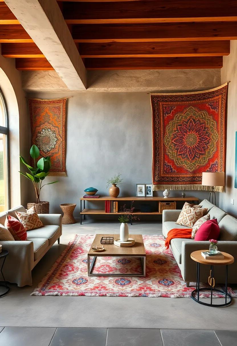
Handwoven tapestries stand as timeless art pieces, their rich textures and intricate patterns telling stories of skilled craftsmanship and cultural heritage. Mounted on accent walls, these tapestries infuse a room with warmth and vitality, transforming bland surfaces into focal points brimming with character. The use of warm, vibrant colors such as deep ochres, fiery reds, and sunset oranges not only invites a sense of coziness but also energizes the space, creating an eclectic harmony that invites conversation and admiration. Their tactile quality invites touch, offering a unique sensory experience that complements visual appeal.
To amplify their impact, consider pairing tapestries with these styling ideas:
- Natural Wood Frames: Emphasize the organic feel by framing tapestries with reclaimed or polished wood, enhancing the earthy tones.
- Layered Lighting: Use warm-toned lamps or spotlights to highlight the textures and colors, adding depth and mood.
- Complementary Décor: Incorporate cushions, rugs, or ceramics in matching hues to weave a cohesive story across the room.
Here’s a quick guide demonstrating color combinations that work wonders with warm-hued tapestries:
| Warm Tapestry Shade | Complementary Accent Color | Style Tip |
|---|---|---|
| Burnt Orange | Muted Teal | Add cushions or vases in teal for balanced contrast. |
| Deep Red | Soft Gold | Use gold-toned frames or light fixtures to highlight richness. |
| Golden Ochre | Earthy Greens | Introduce potted plants or fabrics in green shades for natural vibrancy. |
Arranging Open Shelving with Colorful Books and Curated Artifacts to Enhance the Eclectic Vibe
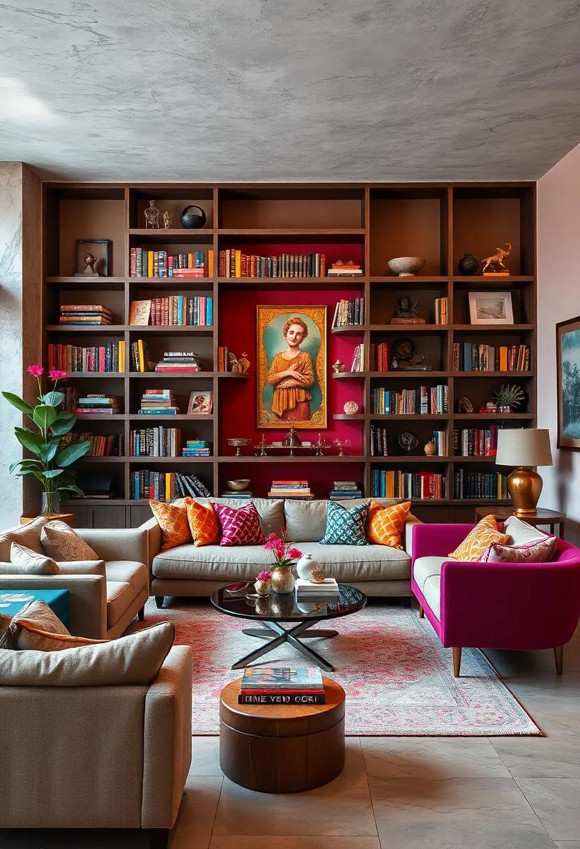
Open shelving becomes a canvas for expression when adorned with colorful books and carefully selected artifacts. The vibrant hues from book spines, ranging from deep magentas to sunlit yellows, create a rhythmic pattern that immediately commands attention. Interspersing these books with treasured items – think vintage ceramics, quirky sculptures, or travel mementos – adds layers of personality and narrative. This dynamic display not only showcases your collection but also invites curiosity, making the shelves a focal point that celebrates individuality within a lively living space.
To balance visual interest with cohesion, consider organizing items through a mix of deliberate chaos and thoughtful groupings. Use open shelves to create contrast by pairing books stacked both vertically and horizontally alongside artifacts of various sizes and textures. Incorporate natural elements such as small potted plants to inject freshness and soften the overall look. Here’s a simple guide to achieving a well-curated eclectic vibe:
- Color Coordination: Group books by color families or alternate bright and neutral tones for visual rhythm.
- Texture Play: Mix matte pottery with glossy glass pieces or woven baskets to enrich tactile depth.
- Balance Scale: Place larger artifacts near smaller books to avoid visual heaviness on one side.
- Breathing Room: Leave some empty spaces to prevent clutter and let each piece stand out.
Employing Bold Geometric Patterns in Throw Pillows and Upholstery Using Saturated Color Schemes
Bold geometric patterns act as the visual heartbeat in eclectic living rooms, especially when showcased on throw pillows and upholstery. These patterns infuse energy and rhythm, transforming simple furniture into captivating focal points. When paired with saturated color schemes, they create a dazzling interplay of hues that invoke both excitement and harmony. Imagine a deep teal sofa adorned with mustard yellow cushions featuring sharp triangles or hexagonal motifs-this contrast not only highlights architectural lines but also invites tactile engagement, making your space feel both lively and thoughtfully curated.
To master this technique, consider layering textures and shapes that complement rather than compete. Start by selecting a dominant color palette rooted in jewel tones like emerald green, ruby red, or sapphire blue. Then, introduce throw pillows with angular prints and upholstery fabrics that echo these forms but vary in scale. Employing an arrangement such as:
- Large-scale geometric prints on the main upholstered piece
- Mid-sized patterns on accent pillows
- Small, contrasting geometric details through accessories like ottomans or footstools
This layered approach ensures visual depth without overwhelming the senses, crafting a vibrant harmony that is at once bold and inviting.
Creating a Dynamic Focal Point with a Boldly Colored Fireplace Mantel and Coordinated Decor
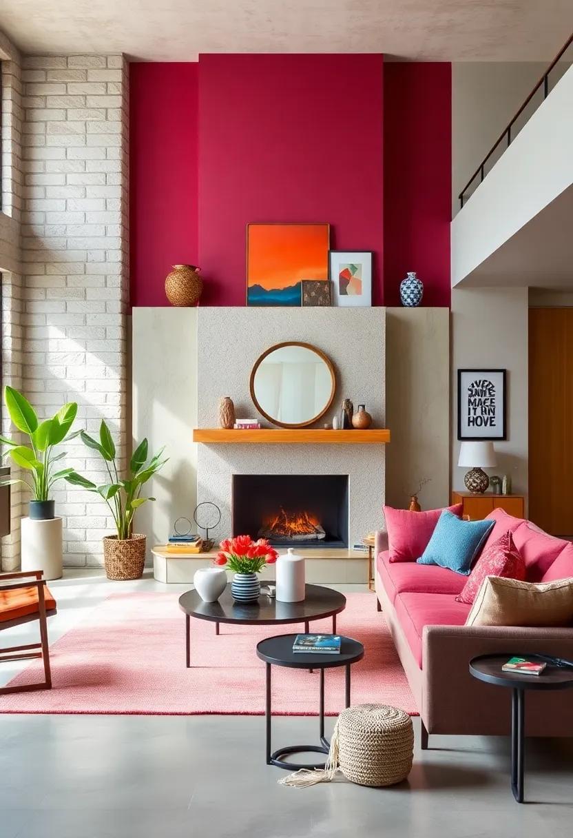
Transforming your fireplace mantel into a vibrant centerpiece starts with embracing bold, saturated hues that invite the eye and set the tone for the entire space. Consider shades like deep teal, rich mustard, or fiery coral, as these colors naturally draw attention and create a visual anchor in your living room. Pairing the mantel’s dominant color with coordinated decor-such as velvet throw pillows, patterned rugs, or ceramic vases-helps to weave a cohesive narrative throughout the room. This intentional repetition of color not only unifies diverse elements but also elevates the eclectic charm, turning what could be a simple architectural feature into a dynamic work of art.
To balance boldness with harmony, focus on:
- Mixing matte and glossy textures around the mantel for depth and interest.
- Incorporating metallic accents like brass or copper to add warmth and light reflection.
- Selecting artwork or mirrors with hints of the mantel’s shade to echo the theme subtly.
- Using natural elements-such as greenery or wooden décor-to soften and ground the bold palette.
| Element | Color Suggestions | Texture Tips |
|---|---|---|
| Fireplace Mantel | Deep Blue, Burnt Orange | Glossy Paint Finish |
| Throw Pillows | Mustard Yellow, Olive Green | Velvet or Linen |
| Decorative Vases | Ceramic in Muted Pastels | Matte or Satin Glaze |
| Metal Accents | Brass or Antique Gold | Polished or Textured |
Using Layered Drapery in Rich Textiles Highlighted by Contrasting Tiebacks for Elegant Flair
Transforming your living space with layered drapery invites an exquisite sense of depth and texture that instantly elevates the ambiance. Utilizing rich textiles such as velvet, silk, or brocade in multiple layers allows for playful interaction between light and shadow, adding warmth and sophistication. When these lavish fabrics are paired with contrasting tiebacks-think matte leather against glossy silk or metallic tones alongside soft hues-the window treatments become focal points that harmonize the eclectic theme without overwhelming it.
Consider incorporating tiebacks that offer both function and flourish:
- Color contrast: Select tiebacks in bold hues like emerald green or burnt orange to punctuate neutral or jewel-toned curtains.
- Texture interplay: Mix supple fabrics with unexpected materials like braided rope, tassels, or ornate metal clasps for tactile interest.
- Shape variety: Use oversized or sculptural tiebacks to create distinctive silhouettes against the layered drapes.
| Layer | Fabric Type | Suggested Tieback Material | Effect |
|---|---|---|---|
| Base Layer | Heavy Velvet | Matte Leather | Rich and grounded appearance |
| Middle Layer | Sheer Silk | Metallic Chain | Delicate shimmer and flow |
| Top Layer | Embroidered Brocade | Braided Rope | Distinctive, elegant texture |
To Conclude
In the end, crafting an eclectic living room with rich colors is more than just a design choice-it’s an artful expression of personality and possibility. By weaving vibrant hues into a harmonious tapestry, each piece tells its own story while contributing to a collective, colorful symphony. Whether you favor bold contrasts or subtle blends, the key lies in balance and intention. Embrace the adventure of vibrant harmony, and watch your living space transform into a dynamic haven where creativity and comfort coexist in vivid celebration.